Field Sessions

Real talks, real rooms, real reactions

Written up as they actually happened, including the parts that didn't land. Browse by the kind of room it happened in, or jump straight to any session by name.

Field Sessions

Where this gets tested in front of a real room

Not written from a desk. These are talks and workshops where the mechanisms on this site got put in front of actual people, and I found out, in real time, what actually lands. Search by name, or filter by the kind of room it happened in.

Coming soon: not yet written up

A session recap, not a study Field Session

Teaching Year 8/9 students the maths their brains skip

Why do smart 14-year-olds still think “50% off” means they're saving money?

A high school · Year 8/9 · an “Everyday Banking” talk

My own kids sometimes ask what I actually do at a bank, and I've learned the answer that sticks is always a demonstration. I got the same chance with a room of Year 8 and 9 students, and opened with the one that always lands hardest: a pair of sneakers, marked down live in front of them.

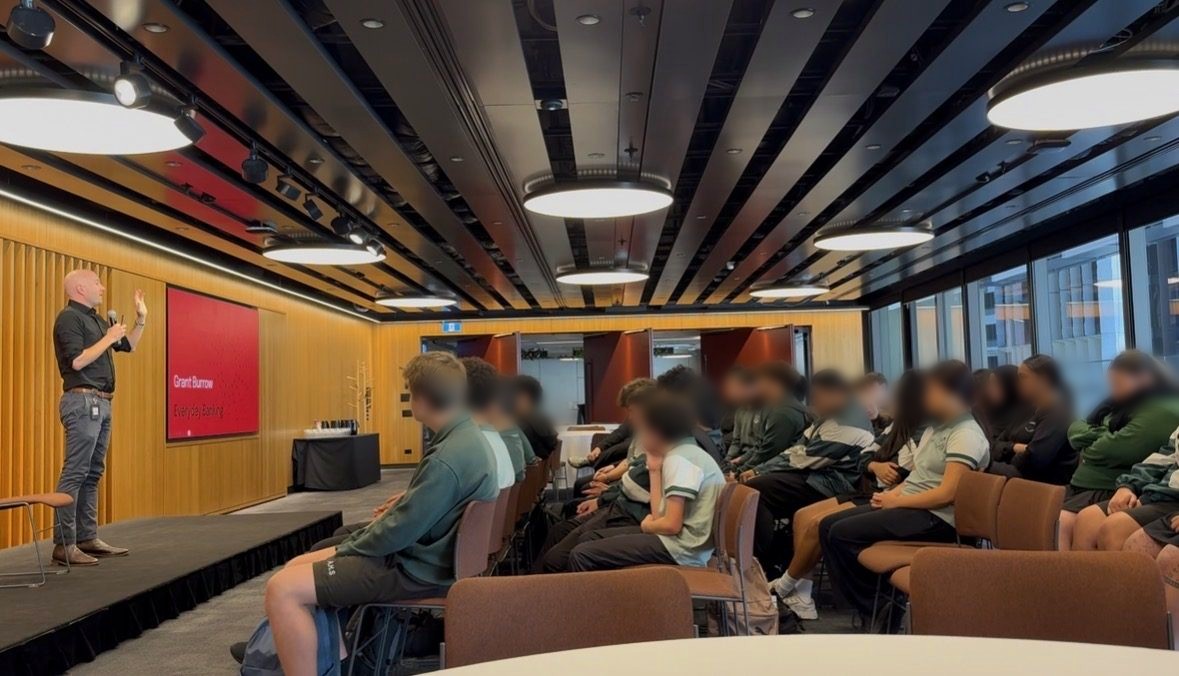
Presenting to a room of Year 8/9 students at a high school
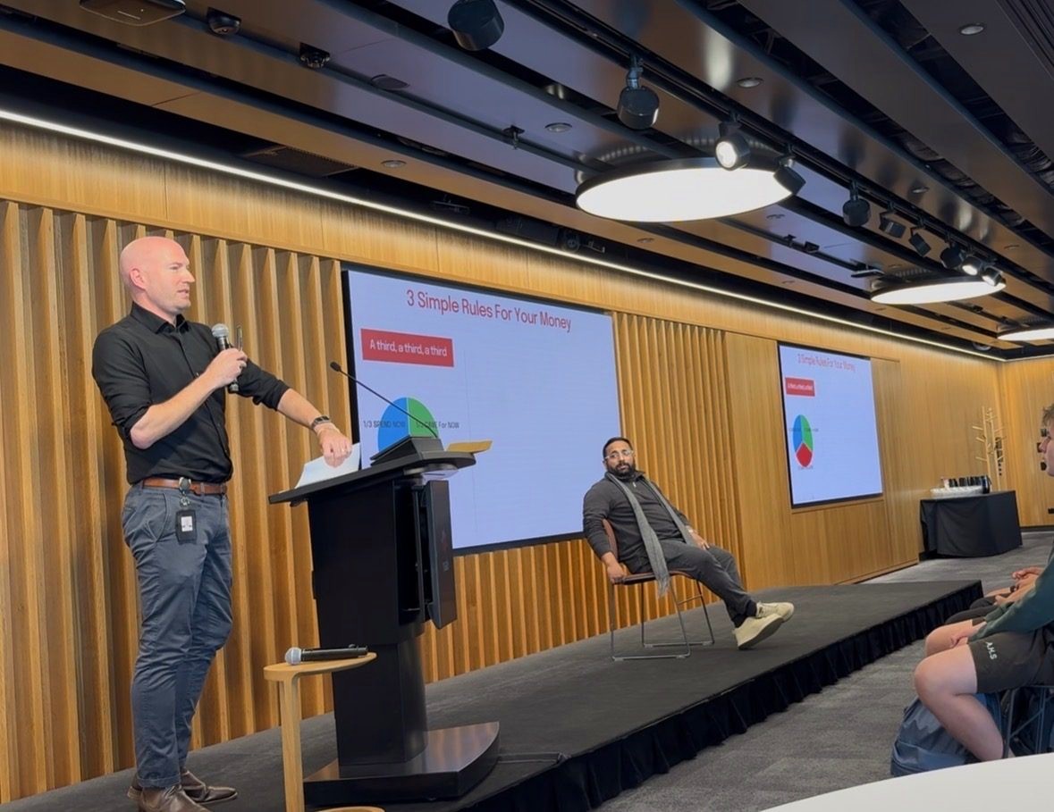
At the podium, presenting the “a third, a third, a third” rule
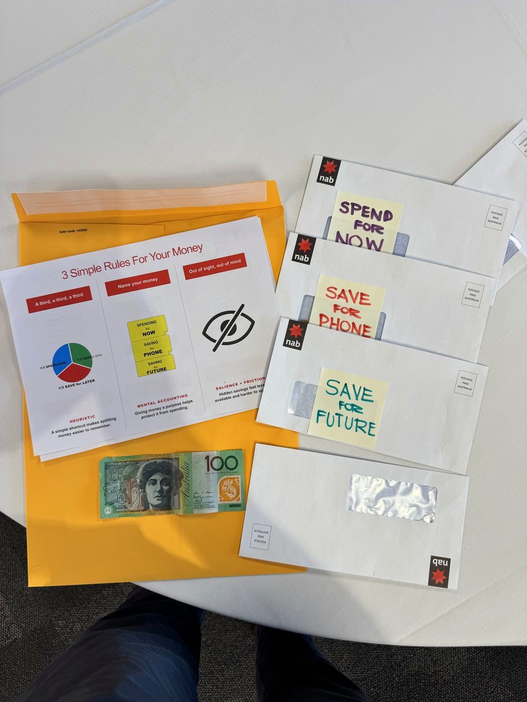
Four hand-labelled envelopes: Spend for Now, Save for Phone, Save for Future
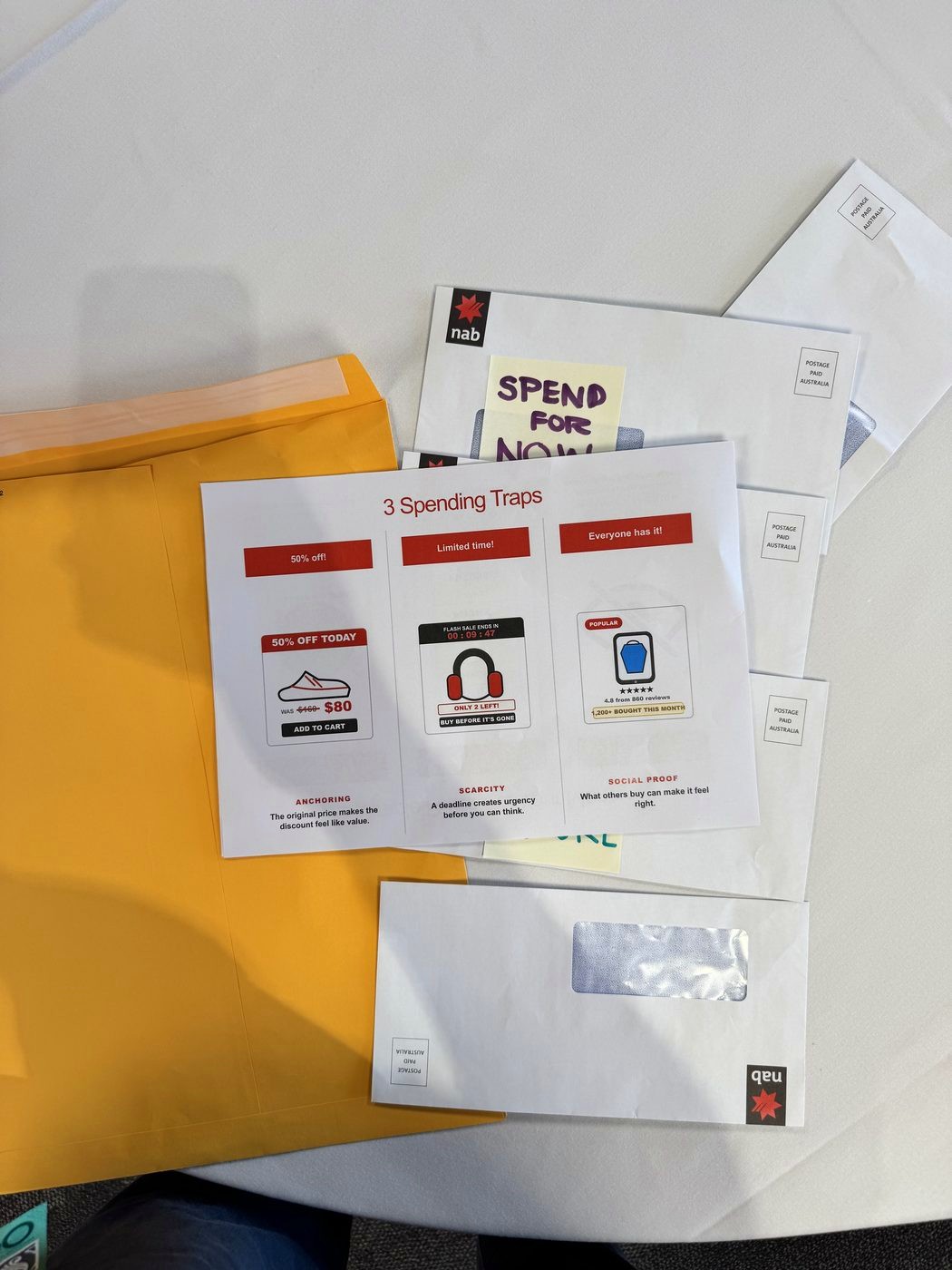
The “3 Spending Traps” handout: anchoring, scarcity, social proof
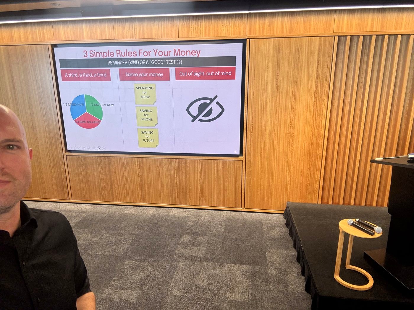
The “3 Simple Rules For Your Money” slide on screen

From the actual session: the envelopes, the handout, and the room.

Live demo, not a controlled study
A room of Year 8/9 students, no warning about what was coming
Held up a pair of sneakers. Priced them at $160.
Dropped the price to $80, live, 50% off.
Asked the room: “How much are you saving?”
Hands shot up: “$80”

Wrong question, wrong answer, and that was the point. Nobody in that room had $160 in their hand a minute earlier. They weren't saving $80, they were spending it. The $160 was never a real price; it was planted as the number everything else would get judged against, the exact trick behind every “was, now” tag in a shop window.

Why it landed: A wrong answer they'd all just given out loud, corrected on the spot, stuck harder than being handed the definition first. See the full write-up: Anchoring.

Three saving habits, not a budgeting app

The anchoring demo was the hook; these are the habits it set up the room to hear: the rules behind the envelopes, simple enough to run without a spreadsheet, a calculator, or an adult checking in.

Heuristic

A third, a third, a third

Split whatever comes in three equal ways before deciding what to do with any of it: a third to spend now, a third to save for something specific, a third to put away for later. No tracking, no app, just one rule simple enough to actually use.

Mental Accounting

Name your money

Giving each third a label before it reaches your hand, “spending for now,” “saving for phone,” “saving for future”, makes it feel already spoken for. Unlabelled money is money your brain treats as fair game.

Salience + Friction

Out of sight, out of mind

Hidden savings feel less available and take more effort to reach, which is exactly why they survive. The friction of pulling money back out isn't a flaw in the system; it's the point.

Why it landed: We simulated ten weeks together, one coin at a time into each envelope, and by the end there was $30 sitting in the “save” envelopes that nobody had consciously decided to save. It just never got the chance to be spent, because it already had a job. See the full write-up: Mental Accounting, Salience & Good Friction.

Three spending traps

Naming the saving habits only covers half the room's money; the other half needs recognising what's working against it: the same tricks, printed on one slide, that shops and apps use every day, none of which needed to be true to work.

Social Proof

Everyone has it

“4.8★ from 860 reviews, 1,200+ bought this month.” What other people already picked leaks into what feels safe to pick, whether or not it's actually the best option on the shelf.

Scarcity

Limited time!

“Flash sale ends in 09:47, only 2 left.” A countdown or a low-stock label creates urgency to decide before there's time to actually think it over, true shortage or not.

Anchoring

50% off!

“Was $160, now $80.” The struck-through price, not the actual price, does the persuading, the same demo that opened this session, printed onto a product tile.

Why it landed: Naming each trick out loud, once, made it recognisable later, a few students called out “anchoring!” unprompted at the last tile, having only heard the word twice before. See the full write-up: Scarcity & Social Proof.
To a teenager's brain, money isn't a calculator, it's closer to a calculator crossed with Instagram.

None of them will remember the word “anchoring” by lunch, and that's fine. What stuck was thirty hands going up for “$80 in savings” and getting told, on the spot, that they'd just fallen for it. That moment worked because it was theirs, said out loud, in front of the room. The envelope demo only half-had that: I narrated it from the front instead of putting real coins in real hands, and the parts of the talk they argued about afterwards were, without exception, the parts they'd actually touched. Next run, every pair of hands gets coins for that one.

The mechanisms behind this session: Anchoring, Mental Accounting, Salience, Scarcity, and Social Proof, each gets the full study-and-citation treatment on the Principles page. This is what they look like applied to a room of 13- and 14-year-olds instead of a lab.
Taken further: Does naming a savings pocket keep the money there?, the envelope-and-label mechanism from this room, proposed as a randomised test inside a real banking app.

A session recap, not a study Field Session

Finding the “Phase 2” every roadmap quietly skips

Could you defend the arrow from your last initiative to actual profit, out loud, right now?

Product, Design & Digital teams · a talk on outcome logic and experimentation

I opened with South Park. The gnomes in the underpants-collecting episode have a business plan on a whiteboard: Phase 1, collect underpants. Phase 2, a question mark. Phase 3, profit. Pressed on Phase 2, they don't have an answer. I put that slide up first so the room could laugh before I told them it's also, more or less, our own roadmap slides.

How the talk opened
A room of product, design, and digital people, looking at gnomes
Most of our own initiative slides do the same thing: Customers → Initiative → ? → Profit.
The “?” gets filled with whatever's easiest to point at: NPS, Engagement, “Project X.”
None of them are the actual outcome

That gap has a name: the Phase 2 Problem. Thomas Sowell subtitled a whole book on this: economics, he wrote, is “thinking beyond stage one.” The gnomes never think beyond stage one. Neither do most roadmap slides.

Why it landed: Asked to defend their own Phase 2, out loud, in front of the room, most people got about one sentence in before they stalled. The same gap the gnomes have, just better dressed. See the full write-up: Illusion of Explanatory Depth.

Three reasons the gap is dangerous

The Phase 2 Problem isn't just an amusing gap between the gnomes and a roadmap slide. It's a costly one, for three separate reasons, none of them “stop shipping.” They're reasons to find out fast, at the cheapest link, instead of at the end of the whole chain.

Kohavi et al., 2009

Most ideas don't work

At Microsoft's own experimentation platform, only about a third of tested ideas improved the metric they were built to improve. Most ideas that feel obviously right, aren't.

The Voltage Effect

What works shrinks at scale

Across List's applied research, 50 to 90 percent of programmes that showed real promise in a small pilot lose most of that effect once rolled out at scale.

Rube Goldberg

More links, more that can break

Every extra step between an initiative and its outcome is one more place the chain can quietly snap, and most roadmaps have five or six links nobody's checked.

See also: Lab vs. Field: why where you test it matters, on this site's Reading the Research page.

The example that landed hardest: “just increase engagement”

I asked the room to map the outcome logic for a familiar one: a bank wants customers using the app more. The chain nearly writes itself: Customers → Engagement → Loyalty → Retention → Products per Customer → Profit. Simple. Or is it?

Zhang, C. Y., Sussman, A. B., Wang-Ly, N., & Lyu, J. K. (2022). “How Consumers Budget.” Journal of Economic Behavior and Organization, 204, 69–88
A nationally representative US survey (n=3,826), supplemented with real administrative account data (n=194,678) from a large Australian bank.
Key findings
Verbatim (paper text)“We find that engagement is negatively correlated with financial wellbeing (r = -0.34) … engagement decreases with financial wellbeing.”
ParaphrasedCustomers with the highest digital engagement, the most daily logins, had the lowest financial wellbeing scores in the sample: the opposite direction the naive “engagement equals loyalty” chain assumes.
Why it landed: Several people in the room had shipped an “increase engagement” initiative at some point. Watching the metric they'd have celebrated turn out to correlate with financial stress, not loyalty, was the moment the talk stopped being theoretical.
Everyone in the room could draw the arrow from Initiative to Profit. Almost nobody could defend it.

Neither the Kohavi statistic nor the Sowell quote did the real work here. What landed was watching people try to map their own Phase 2, live, for something they'd actually shipped, and hit the gnomes' wall themselves. Nobody enjoys realising their own success metric was a proxy for something else. The sequencing gave some of them an out, though: people who mapped their own initiative after seeing the digital-engagement twist already knew what was coming, so their version was less honest than the ones who went first. Worth running the exercise before the reveal next time, not after.

The mechanisms behind this session: Illusion of Explanatory Depth, the full study-and-citation treatment is on the Principles page. This is what it looks like applied to a room mapping their own roadmaps instead of a zipper.
The formalised version: Your Roadmap Has a Phase 2 maps a full outcome chain, stage by stage, on one worked example, naming the real metric and the proxy trap at every link.

A session recap, not a study Field Session

Why telling customers what's “safe to spend” can make them spend more

What if the reassuring number on the home screen is what's causing the overspending?

Digital, Design & Product teams · a talk on payment friction and spending nudges

The assumption behind most banking-app design for the last decade has been: more visibility into your money is always good. Show people their real-time balance, show them what's “safe to spend” after upcoming bills, and they'll spend more responsibly. I opened this talk with a number that quietly breaks that assumption.

The finding that opened the talk
A room of digital, design, and product people, most of whom had shipped a “balance” or “safe to spend” screen
Buy-now-pay-later purchases get deferred, so today's balance doesn't yet reflect what's already spent.
That inflates what looks “safe to spend” right now.
22.2% more likely to make a discretionary purchase

Showing people more money than they actually have to spend, spends more of it. Central Bank of Ireland researchers found BNPL usage itself raised spending 4.39% over debit, and the inflated “available balance” it leaves behind was doing real, separate work of its own.

Jose, A., Kelly, J., King, M., & McCarthy, Y. (2025). “Buy Now, Spend More, Pay Later: Behavioural Mechanisms of Buy Now Pay Later Products.” Central Bank of Ireland Research Technical Paper, 15/RT/25
A field-and-lab experiment on real BNPL and debit spending behaviour, published by Ireland's central bank.
Key findings
ParaphrasedBNPL usage led to spending 4.39% more than the identical purchase made on debit.
ParaphrasedAn inflated perception of remaining balance, left behind by prior BNPL use, made a subsequent discretionary purchase 22.2% more likely, even one with no BNPL option involved.
ParaphrasedThe mere expectation of future BNPL access raised current debit-card spending by 3.1%, before any deferred payment had even been used.
See also: When Interventions Backfire on this site's Reading the Research page, the same shape of problem: a well-intentioned transparency feature moving behaviour the wrong way, the way the Energy-Bill Boomerang did for households already using less than their neighbours.

The gradient underneath it: cash, debit, credit

The BNPL finding is one point on a much older curve, not a one-off quirk of buy-now-pay-later. Same purchase, same price: how much “pain” you feel paying for it depends entirely on how the money leaves your hand.

The baseline

Cash

Physically counting out notes makes the loss vivid and immediate, the most “painful” way to pay, and reliably the one that produces the lowest spending.

Runnemark, Hedman & Xiao, 2015

Debit

A real till experiment found willingness to pay measurably higher on debit than cash for the identical purchase, same money, one step less vivid.

Prelec & Simester, 2001

Credit

In a real auction for Boston Celtics tickets, bids paid by credit card ran about 100% higher than bids paid by cash, same tickets, same room, the only variable was what was in people's hand when they bid.

Why it lines up: all three sit on one continuum: how tightly the act of paying is coupled, in time and attention, to the moment of spending. See the full write-up: Pain of Paying.
The less paying hurts, the more you buy, a “safe to spend” number is just credit's trick wearing a helpful face.

Most of the room had shipped a feature that removed friction somewhere in a payment flow, in the name of a smoother experience, without checking whether the friction they'd removed had been doing real protective work, an uncomfortable thing to sit with. Nobody sets out to build the credit-card effect into a savings feature. I ran the audit live against a stranger's balance screen, not theirs, and it showed anyway; a room auditing its own screens instead of watching me do it to someone else's would find more, and mean it more.

The mechanisms behind this session: Pain of Paying and Mental Accounting, each gets the full study-and-citation treatment on the Principles page. This is what they look like applied to a balance screen instead of a coffee purchase.
A session recap, not a study Field Session

Why your best pilot is the one most likely to lose its voltage

What if using your very best people is exactly what makes a pilot fail to scale?

Product, Design & Digital teams · a talk built around John List's The Voltage Effect

Economist John List has spent years asking a specific, unglamorous question: why do so many ideas that work beautifully in a small pilot fall apart the moment you try to run them for everyone? His book The Voltage Effect calls the pattern a “voltage drop,” and I'd already used it lightly in an earlier session on outcome logic. This talk was the deeper version, built around one of List's own field experiments, and the story I think most directly explains the “very best” trap product teams fall into without noticing.

Experiment Teardown
1.5 million real Uber riders who'd just had a ride arrive more than 5 minutes late
Left with nothing, a bad ride quietly cost Uber future business: riders spent 5–10% less afterwards than riders who hadn't had one.
Same late ride, same rider, only the apology differed
Words only
An apology message: no compensation attached
+ $5 coupon
The same message, with a $5 credit towards a future ride
Result Words only + $5 coupon Wins
Spend Flat Recovers

A costly signal repaired the relationship. A free one didn't move it. But run the identical $5-coupon apology after a rider's second or third bad ride, and it stopped working. The same coupon that repaired trust the first time measurably backfired the second, leaving people spending less than if Uber had said nothing at all.

Internal validityA real nationwide dataset: 1.5 million riders' actual future spending, not a survey of stated intent to keep using the app.
External validityOne company, one type of failure (a late ride). Whether the same backfire threshold holds for a costlier failure, a bounced payment, a frozen card, or a different industry entirely isn't something this study can answer on its own; worth testing before assuming it transfers.
Halperin, B., Ho, B., List, J. A., & Muir, I. (2022). “Toward an Understanding of the Economics of Apologies: Evidence from a Large-Scale Natural Field Experiment.” The Economic Journal, 132(641), 273–298
A nationwide field experiment on 1.5 million real Uber riders, run while List was the company's chief economist, not a lab survey.
Key findings
ParaphrasedA late ride, left unaddressed, cost Uber roughly 5–10% of that rider's future spend on the platform.
ParaphrasedA $5 coupon was a more effective apology than words alone, and paid for itself, a positive net return for Uber even after the cost of the coupon.
ParaphrasedSending the same coupon apology after a second or third bad ride reversed direction, a “backfire effect” the authors attribute to riders reading each apology as a promise, broken again by the next failure.
See also: The Voltage Drop at Scale on this site's Reading the Research page, and the Voltage Effect trio in the outcome-logic session above, the same idea, one study deeper. The government-scale version of this same problem: Why Governments Need Policy-Based Evidence, Not Just Evidence-Based Policy.

Three ways a promising pilot lies to you

The Uber apology result is a genuinely good piece of List's research, but it's a different trap: costly signals losing their power on repeat, not a pilot failing to scale. The trap this session's title is actually about shows up here: List calls these “vital signs,” and missing one is why an idea that worked beautifully in the room won't survive contact with everyone else.

List, Fryer, Levitt & Samek

Chef, not ingredients

If a pilot only worked because you staffed it with your very best people, it can't scale. You can't mass-produce a star performer. This is List's representativeness check: is the pilot's sample, staff included, actually typical, or already stacked with people who'd make anything work? His own Chicago Heights preschool experiment (CHECC) deliberately used ordinary local teachers, not the best ones, precisely so its result, a real 0.22 SD gain in early academic skills across ~600 children, would still hold once it left the pilot.

Vital sign

False positives

A pilot that “worked” might just be noise, or a novelty effect that fades once the excitement of being watched wears off. Small samples make it easy to mistake luck for a real, repeatable effect.

Vital sign

Spillovers

Scale changes the system around the idea. Uber's own rider-growth coupons boosted demand enough, at scale, to push up fares and wait times, which then suppressed the very demand the coupons had created. A pilot too small to move the market can't see this coming.

List names a fifth vital sign this trio doesn't have a card for: cost traps, a pilot's unit economics rarely survive contact with real volume, because support load, manual exceptions, and review time scale worse than the happy path a small pilot gets to run on. It's the same question the “before you scale it” checklist below asks directly: do the numbers still work at ten times the volume, not just in the room?

Citation: List, J. A., Fryer, R. G., Levitt, S. D., & Samek, A., the Chicago Heights Early Childhood Center (CHECC), funded by a $10M Griffin Foundation grant, is documented across several NBER working papers including NBER No. 21477. Reported effect at the 9-month follow-up: +0.22 SD on early academic skills, +0.16 SD on executive functioning, relative to control. See also: Chef or the Ingredients, Representativeness, False Positives, Spillovers, and Cost Traps each get the full study-and-citation treatment on the Principles page.
The pilot that used your best people isn't evidence the idea works. It's evidence your best people work.

Ask any room who staffed their last pilot with their A-team, and most hands go up, on purpose, to give the idea its best shot. That instinct is exactly what CHECC's design pushes against, and it's the story that actually landed harder than Uber's, because it runs against instinct instead of just being a good result. List's point isn't subtle once you sit with it: stacking a pilot with your strongest people answers a different question than the one you meant to ask, and most teams never notice they asked the wrong one.

The mechanisms behind this session: False Positives, Representativeness, Chef or the Ingredients, Spillovers, and Cost Traps, List's five “vital signs,” each with the full study-and-citation treatment on the Principles page.
Taken further: Does a costly, specific apology beat a generic one after a service failure?, the Uber finding above, designed out as a live service-recovery test. Both CHECC and the Uber study exist because List and his organizational partners were willing to call these what they were: Don't Say the E-Word covers why so few organisations do.
A session recap, not a study Field Session

What my dentist got right, without ever hearing the term “behavioural economics”

How many of these would still be running if nobody in the building could name a single one?

A routine check-up and filling · one patient's real-time field notes, not a talk

I went in for a routine check-up and a filling, mentioned somewhere between the X-ray and the drill what I actually spend my time thinking about, and spent the rest of the appointment quietly cataloguing behavioural economics. None of it looked designed. It didn't need to. It was happening anyway, and I'd bet it's already sitting in that practice's revenue numbers whether anyone there could name a single one of these mechanisms.

One appointment, not a controlled study
Present-me, weighing a filling I didn't want today against a future-me who wouldn't thank me for skipping it
Ostrich Effect had the booking sitting untouched for months, a text with the exact date, and being asked to write it into my own calendar before I left last time, got me there anyway.
She broke the news plainly: here's what's wrong, here's why, no minimising, then closed the conversation warm. Bedside manner is peak-end management, whether she'd call it that or not.
The first number on the table was the full treatment plan, priced as one figure, before anything got broken down. Everything after that got judged against it.
Then it got split into what needed doing now, what could wait, and what each option actually cost, in dollars and in downside, side by side.
Near the end of the plan, the encouragement changed: “one more session and you're done”, and so did my motivation. The closer I got, the less I wanted to stop.
I finished a treatment plan I'd normally have let lapse halfway through

None of this fixed my present bias. It just out-designed it. Present-me was never going to volunteer for a filling over a future I can't feel yet. What actually moved me was one anchored number, a plan I could see the real trade-offs in, and enough “nearly there” along the way to keep finishing what I'd started, the same three moves a gym membership or a savings product leans on, just aimed at a molar instead of a fee.

Why it landed: None of it required me to be talked into anything. Each move just made the honest choice easier to take than the avoidant one. See the full write-up: Anchoring, Tradeoff Transparency & Goal Gradient Effect.

Three things that got me through the door before I'd even sat down

Everything above happened once I was already in the chair. Getting there was its own layer of mechanisms, the pre-appointment work that decides whether you show up at all.

Ostrich Effect

Avoiding news I already expected

I'd let the booking slide for months. It was never really about finding the time. It was easier not to know what she'd find.

Implementation Intentions

A reminder that actually reached me

A text with the exact date and time did some of the work, but what actually got me there was being asked to write it into my own calendar before I left the last visit. A plan you commit to in your own hand follows through more often than a good intention alone.

Authority Effect

A logo I trusted without reading it

The Australian Dental Association's mark was on the wall, the paperwork, and the toothpaste sample. I couldn't tell you what it actually certifies. I trusted it anyway.

Why it landed: Getting me into the chair had almost nothing to do with the drill and everything to do with removing the moments where I could quietly opt out. See the full write-up: Ostrich Effect. Implementation Intentions and the Authority Effect don't have their own write-ups on this site yet.

Three small trust signals I didn't clock until I wrote this up

Getting through the door is only the entry fee; what happened next is what decides whether I come back. This is the in-room layer, the part that shapes what I'll say about this practice afterwards.

Zero Price Effect + Reciprocity

Free toothpaste, on the way out

A genuinely free sample at checkout, no fine print, nothing attached to it. The two dollars of toothpaste isn't really the point. Getting something free is Zero Price Effect, but the unprompted gift is what does the relationship work: receiving something you never asked for creates a small, real pull to give something back, whether that's returning, leaving a good review, or just thinking better of the whole visit.

Peak-End Rule

How the visit gets remembered

Bad news delivered plainly, then a warm close and a free sample on the way out. The last few minutes of the appointment do more work on what I'll tell people about this practice than the rest of it combined.

Chunking

Three rules, not a pamphlet

There were instructions I had zero hope of remembering, so I asked her to simplify, and got two or three plain rules back instead of a handout's worth of detail, the same instinct behind the “three simple rules for saving” from an earlier session.

Why it landed: None of these needed to be clever. They just needed to happen at the right moment. See the full write-up: Zero Price Effect, Reciprocity, Peak-End Rule & Chunking.
None of this was designed as behavioural economics. It didn't need to be. It was working anyway, and it's probably already sitting in that practice's revenue line, whether anyone there could name a single mechanism.

What stuck with me wasn't any one moment. It was how many of these were stacked into one ordinary appointment, unplanned, unnamed, and each one doing real work. A dental practice isn't a fintech or a subscription business, and nobody there is running an experimentation programme. It doesn't matter. The mechanisms don't ask permission. If I ran a version of this for a room of clinicians or small-business owners, I'd open with the same question I'd ask any product team: which of these are you already doing by accident, and which one, done on purpose, would actually move the number you care about?

The mechanisms behind this session: Anchoring, Tradeoff Transparency, Goal Gradient Effect, Ostrich Effect, Salience, Zero Price Effect, Reciprocity, Peak-End Rule, and Chunking, each gets the full study-and-citation treatment on the Principles page. Two more showed up along the way: Implementation Intentions and the Authority Effect, which don't have their own write-ups on this site yet. This is what they look like applied to a dental chair instead of a lab.

A session recap, not a study Field Session

Where Behavioural Economics Actually Sits

Why does behavioural economics refuse to pick a side between the spreadsheet and the mystery?

Product, Design & Digital teams · the talk I keep opening with this chart

Every version of this talk opens with the same problem: the room usually already has one of two wrong ideas about what behavioural economics is. Either it's “a fancy word for common sense,” or it's “psychology with extra steps.” Both miss the actual claim, and if I don't fix that in the first five minutes, every example after it lands as a trick instead of a discipline. So the first thing I put on the screen is this chart.

Explainability → Simplicity &scalability ↑ Classical economics thinks like a spreadsheet Behavioural economics part spreadsheet, part Instagram Psychology

Economics is incentives and human decision-making, which is just another way of saying human behaviour. Classical economics sits at one end of that line: high on simplicity and scalability, because it assumes you think like a spreadsheet: rational, consistent, always maximising. Psychology sits at the other end: high on explainability, because it studies the real mechanism, but a full account of one person's decision doesn't scale into a rule you can ship. Behavioural economics sits deliberately between the two, informed by psychology, but still asking “so what should we predict, and when?” It assumes you think in part like a spreadsheet and part like Instagram: mostly rational, with specific, predictable biases layered on top.

The example I use to make that concrete: classical economics predicts a free product and a one-cent product should behave about the same: price is price, and a cent is close enough to nothing. It doesn't. Zero Price Effect research finds that dropping a price to genuinely free doesn't just lower the cost, it changes the category of the decision: demand for a free item jumps far more than a one-cent gap would predict. That's the line I put under the chart: classical economics gets that wrong, behavioural economics gets it right, and the reason is a specific, citable, replicated finding, not a vibe.

*Plus sociology and anthropology, the chart simplifies to two axes, but the discipline draws from more than psychology alone.

Three ways to describe the same line

Not three competing theories, three points on one axis, each trading explainability for scale in a different place.

Classical economics

Optimises for a rational actor

Stable preferences, full information, no shortcuts. Cheap to model, easy to scale, and confidently wrong about the free product.

Psychology

Explains the actual mechanism

Gets closest to what's really happening in someone's head. A full psychological account of one decision, though, doesn't scale into a rule you can apply to the next thousand customers.

Behavioural economics

Predictable irrationality

Keeps classical economics' ambition to predict at scale, but swaps “rational” for “boundedly rational, in specific and repeatable ways”, the trade shown on the chart above.

See the Principles page for 52 of these specific, repeatable patterns, each with the study behind it.

Why any of this matters for product and design work

Definition sorted, the next question is always the same: why does this matter here specifically? Because product and experience work already has a one-line job description most teams never say out loud: it exists to influence human behaviour, on purpose, towards an outcome. Jeff Patton's outcome framework puts that chain plainly: find it → try it → use it → keep using it → say good things, sitting underneath the acquisition, activation, retention, referral and revenue funnel a growth team already reports on every week. If product work is behaviour change, a real model of how people actually decide isn't a nice-to-have layered on top of the roadmap. It's the thing the roadmap is supposedly for.

This session stops at the argument for why the discipline matters here. The deeper cut, actually mapping your own initiative's outcome chain, and where it quietly breaks, is its own field session. And once you've got a chain worth testing, Experiments is where the testing itself lives.
“So it's just marketing with a science degree?”

Fair pushback, and one I get most times I give this talk. The honest answer is falsifiability: marketing wants something to work, and will keep the story if it does. Behavioural economics wants to know exactly when a mechanism stops working, and for whom, that's why every principle on this site carries a named study, a sample, and a methodology critique, not just a claim. I used to leave that distinction for the Q&A. Now I put it straight after this chart, because the room trusts everything that follows a lot more once they've heard it.

The mechanisms behind this session: Zero Price Effect, the full study-and-citation write-up is on the Principles page. This is the argument that sits underneath every other session on this site. For where behavioural science and UX & product design fit onto this same picture, see Behavioural Economics vs. Behavioural Science vs. Psychology vs. UX.

A session recap, not a study Field Session

The Metric That Lied To The Whole Room

What if the metric that convinced you it worked would have gone up anyway?

Product, Design & Digital teams · a talk built around a real Airbnb reveal

There's one objection to running a proper experiment that comes up in almost every room, usually from the most senior person in it: “why can't we just make the change and monitor a metric?” It's a reasonable question, a controlled test costs time, traffic, and engineering effort a simple launch doesn't. So instead of arguing the point, I show a real chart and let the room talk themselves into the wrong answer first. It's a live demo, not a controlled study of my own, but it's the fastest way I've found to make the actual risk felt instead of just stated.

Search page metric, min/max slider → price-tier buttons The feature shipped here 01-01 03-15
A live demo, not a controlled study
Room sees the real search-page redesign: a plain min/max price slider (control) vs. $/$$/$$$/$$$$ tier buttons (treatment)
The metric climbs right through the window the new filter shipped in. I ask: why do you think engagement went up?
The room always has good theories: the buttons are faster to scan, price tiers match how people actually search, the slider was fiddly on mobile. Every one sounds right.
I lied to you: it didn't work, it performed worse. The overall trend never indicated that

Hindsight bias and narrative can make you believe something false, and it's dangerous precisely because it feels like evidence. Every theory the room gave was plausible, internally consistent, and fitted to a chart where the real controlled result, in Airbnb's own case, that the new filter underperformed the old one and wasn't launched, was invisible. The chart never lied. It just never had the answer in it to begin with.

Why it landed: Nobody in the room gets to feel smug here, I ask for theories before I reveal anything, and everybody's theory is wrong the same way. See the full write-up: Hindsight Bias.

The real source, and what it actually found

The example isn't hypothetical or mine. It's a real post from Airbnb's own engineering blog, and it's the one I build this whole talk around.

Overgoor, J. (2014). “Experiments at Airbnb.” The Airbnb Tech Blog (Medium), May 27, 2014
A field example from Airbnb's own experimentation platform: a redesign of the search page's price filter, from a min/max slider to $/$$/$$$/$$$$ tier buttons.
Key findings
Verbatim (from the slide)“…product change while controlling for the aforementioned external factors. In Figure 2, you can see an example of a new feature that we tested and rejected this way. We thought of a new way to select what prices you want to see on the search page, but users ended up engaging less with it than the old filter, so we did not launch it.”
Verbatim (from the slide)“Experiments provide a clean and simple way to make causal inference. It's often surprisingly hard to tell the impact of something you do by simply doing it and seeing what happens… The outside world often has a much larger effect on metrics than product changes do.”
A note on sourcing: the live article sits on Medium, which this session's network access couldn't reach directly to re-verify. The two passages above are transcribed word-for-word from the slide as presented, not independently re-fetched from the source page, treat them as accurate to what was shown in the room rather than freshly checked against the live URL.

Three things eating your metric that have nothing to do with your change

Overgoor's own list, grouped into three buckets worth checking before you credit a launch for anything.

Calendar & weather

The date does work your team didn't

Day of week, season, and, for a travel company like Airbnb, the weather move a metric on their own, with or without a product change sitting inside that window.

The market around you

Promotions and competitors

A competitor's move, or your own marketing team's promotion, can shift the same metric in the same week, for reasons that have nothing to do with the filter you shipped.

Your own other work

Every other team's launch

New features, new products, pricing changes elsewhere in the product, “thousands more,” in Overgoor's own words, are all running on the same graph as your change, at the same time.

See also: Lab vs. Field: why where you test it matters, on this site's Reading the Research page.
“So basically, I can't trust anything I haven't tested?”

Someone asks a version of this most times I run the reveal, usually sounding a little defeated. That's not quite the lesson, and I've learned to say so faster than I used to: it's not that metrics are untrustworthy, it's that a metric alone can't tell you why it moved, and a good story about why is exactly what makes people stop checking. The Airbnb example is memorable precisely because the story was so plausible: faster to scan, better mobile experience, matches how people search, that nobody would have thought to doubt it without the actual A/B result sitting underneath. I used to close this section with the confounder list. Now I close with the reveal line again, because that's the sentence people actually carry out of the room.

The mechanisms behind this session: Hindsight Bias, the full study-and-citation treatment is on the Principles page. See also Why your best pilot is the one most likely to lose its voltage and Finding the “Phase 2” every roadmap quietly skips, two companion sessions on the same underlying discipline.

A session recap, not a study Field Session

Why $350,000 suddenly looks cheap

Why does $6,495,000 make $350,000 feel like a bargain?

Agile Australia 2023 · Hilton Sydney · a talk on product, measurement & behavioural economics, to 200+ product and agile leaders

Agile Australia gave me a room of 200+ product and agile leaders and about 45 minutes. I've given a version of this talk before, the Uber apology finding shows up here too, and so does the Airbnb filter reveal, but this was the first time I'd built the whole thing around one frame: a “10x” way of thinking about product work, and why most organisations never get there. I opened the way I open most rooms: not with a definition, but with a number.

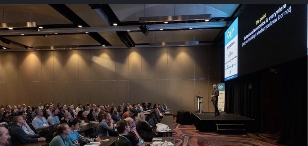
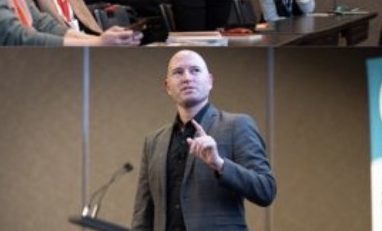
On stage at AgileAus23, Hilton Sydney, presenting to a full ballroom
The opening title slide: Building the world's best product with behavioural economics
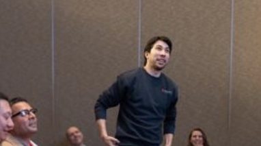
Presenting from the floor, among the audience
Mid-talk, at the microphone
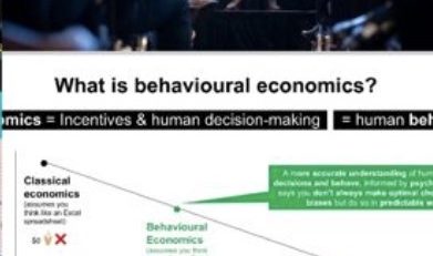
The “What is behavioural economics?” slide: classical economics vs. behavioural economics vs. psychology

From the actual talk: AgileAus23, August 2023.

Live reveal, not a controlled study
A room of 200+ people, shown one number: $350,000. “Is this cheap?”
Right next to it: $6,495,000, a yacht, at the same international boat show a $350,000 luxury car was also on display at.
The room's read on “cheap” flipped, on the same car, same price

It doesn't make rationalistic sense, and that's the point. $350,000 didn't change. What changed was the number sitting next to it. That's not a coincidence in where luxury car makers choose to exhibit: an international boat show, surrounded by numbers with an extra digit, is a deliberately chosen anchor, not just a matching audience.

Why it landed: Same demo, adult-sized numbers, the mechanism is identical to a $160 price struck through to $80, just with three more zeros. Full write-up: Anchoring.

The second reveal ran the same way, with a different lever: free. Ask a room how many people buy coffee on a workday and the guess lands near 50%. Ask about weekly ice cream and it drops near zero, until the ice cream is free, and suddenly everyone's in the queue. It's the same chocolate-pricing result I cite on this site's own Zero Price Effect entry: drop a luxury option from 15¢ to free and a cheaper option from 1¢ to free, and demand for the free luxury option jumps far more than the 1-cent price gap would predict. Two reveals, two audience guesses, both wrong in the same direction, not because the room was slow, but because neither number was ever being judged on its own.

Three common mistakes

The two reveals were the hook. This is the part of the talk aimed at people who already know the terms, because knowing the terms is exactly where these three mistakes start.

Reading the wrong layer

The headline, not the literature

A book chapter or a LinkedIn summary of a study is someone else's compressed take on the methodology, the effect size, and the caveats. Skip straight to the finding and you inherit their compression errors as if they were your own facts.

Overreach

Biases thrown around like candy

Every workshop now has someone naming a bias to explain a result nobody's actually tested for. A label isn't a diagnosis. It's a hypothesis, and it still owes you a measurement before it gets to explain anything.

Good intentions, no measurement

Assuming it worked

A well-intentioned change, shipped without a control group, will always look like it worked, because nothing was ever there to disagree with the story. Confidence of impact only exists on the other side of a measurement, not a launch.

Why it landed: All three are versions of the same failure: substituting something easier (a headline, a label, a good intention) for the harder thing it's standing in for (the study, the test, the measurement).

Quick fire, real examples

The back half of the talk moved fast: a room-tested example a minute, no slide longer than the reveal needed.

Attraction Effect

20 nuggets for $13.70, or 24 for $11.95?

More nuggets for less money makes the bigger box look like the only sane pick, the same “irrelevant” option doing the deciding in a pricing menu as it does in a chicken shop.

Default Effect

The setting nobody switches off

An opt-out pre-selected in your favour costs the other side nothing to leave alone and everything to notice, hidden money for whoever owns the default, not the one who set it.

Salience

“Try free for 30 days!”

The trial is what's printed in size 40 font; the price that starts on day 31 is what's printed in size 10. Both are true. Only one gets looked at.

One I flagged as shaky, on purpose: a well-known finding that signing a declaration at the top of a form (before filling it in) makes people more honest than signing at the bottom, a genuinely clever result, and one that failed to replicate at scale in a 2020 registered replication, years after it shaped real tax and insurance forms. I use it as the closing example precisely because it's a caution, not a case study: read the methodology, check who's replicated it, and stay skeptical of a result just because it's well cited.
Why it landed: Full write-up for each: Decoy Effect, Default Effect, Salience.
It's powerful, like a chainsaw, which means it can cut trees with ease, but also limbs.

That line closed the talk on purpose. The two heavyweight case studies I lean on most, the Uber apology finding and the Airbnb filter reveal, already have their own full write-ups on this site, and I didn't want to re-tell either one here just to pad this session out; both are linked below, exactly as I'd point a room to them afterwards. What this talk added on top was the frame: a “10x” way of judging whether applied behavioural economics actually worked: confidence of impact, speed to learning, scalable learning, probability of working, and the size of the measurable outcome, and most of the room's own honest answer, when I asked which of the five they were weakest on, was measurement. Not the theory. Not the idea. The part where you find out if you were right.

The mechanisms behind this session: Anchoring, Zero Price Effect, Decoy Effect, Default Effect, and Salience, each gets the full study-and-citation treatment on the Principles page.
The two case studies this talk builds on: The Metric That Lied To The Whole Room (the Airbnb filter reveal) and Why your best pilot is the one most likely to lose its voltage (the Uber apology study), both get their own full session on this site rather than a retelling here.
The chainsaw line, taken further: Not Testing Is Still a Bet, same idea, argued at length: the power to change behaviour at scale is also the power to do real harm at scale, and that's an argument for measuring carefully, not for not experimenting at all.