The Science Behind

Real products, decoded into the mechanism

Something real you could actually buy or run into, broken down to the exact mechanism doing the work, each one linked to its cited study. Browse by category, or jump straight to it by name.


By signal

Why does raw selvedge denim feel like better quality than jeans that actually fit?

Narrower fabric, a rough unfinished hem, no stretch, and a price tag several times a regular pair, on paper this should read as worse, not better. Four real mechanisms explain why it doesn't.

Craft & Materials What Looks Handmade
Meaningless Differentiation

A raw pair's most visible detail is its selvedge: a tightly bound, self-finished edge along the outseam, usually shown off with a cuffed hem. It's only there because the fabric was woven on a narrow, slow shuttle loom instead of a wide modern one, and on its own it doesn't make the jeans fit better, wear longer, or hold dye any differently. A buyer doesn't need to know any of that, or verify any of it, to read the cuffed edge as proof of a slower, more careful process, the same Meaningless Differentiation logic as an invented fabric grade: a specific, hard-to-fake detail standing in for a quality check nobody actually ran.

IKEA Effect

That's the visible edge, working before a pair is ever worn. What happens after purchase runs on a different mechanism entirely. Raw denim is sold unwashed and untreated on purpose. Over months of real wear, it creases and fades exactly where its owner actually sits, kneels, and carries a phone. That's IKEA Effect running after the purchase instead of before it: the labour of breaking a pair in is real, and it's exactly what makes two worn pairs of the identical model look nothing alike.

Scarcity

Break-in labour and the selvedge edge both work on any raw pair, sold anywhere. The next mechanism explains why raw denim itself stayed rare enough to matter in the first place. Old shuttle looms weave a narrower bolt of fabric, much more slowly, than the wide projectile looms most denim is made on today. Cone Mills' White Oak plant, once the last large American shuttle-weaving mill, closed for good in 2017. Japan's Kojima district kept its old Toyoda shuttle looms running specifically because the slower weave produced better fades, real Scarcity tied to an actual, shrinking production capacity, not a manufactured countdown timer.

Halo Effect

Scarcity explains why the fabric is hard to get. The last mechanism explains what people assume once they actually have it. “Woven on the same looms for decades” is a true fact about how the fabric was made. It also gets read as a guarantee of things that fact never actually tested, how the stitching holds up, how the dye wears, whether the fit is any good, the textbook shape of Halo Effect: one real, verifiable trait quietly standing in for others nobody checked. All four run at once on the same pair: a visible edge standing in for a quality check, labour marketed as part of the purchase, a real production bottleneck read as prestige, and one true fact about the loom implying others nobody tested.

Real vs. perceived
Genuinely real
  • Shuttle looms weave a narrower bolt, more slowly, so real output per loom is lower than a modern wide loom's
  • The self-finished selvedge edge doesn't fray without stitching, a genuine structural difference
  • Unwashed indigo fades unevenly, tracking the wearer's own real habits over months
Psychological framing
  • Meaningless Differentiation: the visible cuffed edge reads as proof of quality, whether or not the buyer knows why it's there
  • IKEA Effect: break-in labour is marketed as part of what's being bought
  • Halo Effect: loom provenance implies things about durability nobody actually tested
Sources

Each mechanism above is fully cited, with the real academic study behind it, on its own Principles page entry (linked throughout). The denim production history is drawn from industry references, not academic sources: Redcast Heritage's history of Japanese denim, Heddels' field tour of Kojima's shuttle and projectile looms, and Okayama Denim's account of the Toyoda G3 shuttle loom.

Real examples

Real, currently operating brands, shown to illustrate the price range this mechanism spans, not an endorsement of any one of them. Prices move, check the brand's own site for what it actually costs today.


Why does the same coffee taste sweeter from one side of this pink cup than the other?

A 200ml porcelain filter cup with a thin lip on one side, a thick lip on the other, and a soft pink glaze, three real design choices built on one idea: change the cue, not the coffee.

Food & Drink What Feels Premium
Crossmodal Correspondence

This cup runs the identical trick through two different senses at once, touch and sight, so the same sip gets nudged twice before taste ever gets a say. Both cues are grounded in a real, separately run experiment, not a single study stretched to cover both claims.

The rim

It isn't the same thickness all the way round, on purpose. Sip from the thick side and a thicker layer of tea lands on the tongue; sip from the thin side and a thinner layer lands instead.

THE SAME TEA TASTES DIFFERENT POURED FROM A DIFFERENT-LIPPED GLASS POURED FROM A THICK-LIPPED GLASS RATED SWEETER Identical tea, same temperature POURED FROM A THIN-LIPPED GLASS RATED MORE BITTER The identical tea, poured moments apart Nothing in the tea changed. Only the glass touching the lips did.

Ichimura, Motoki, Matsushita & Ariga (2023) manipulated the actual physical thickness of a glass's lip and served the same tasters identical tea from each, isolating touch as the one thing that changed.

The glaze

The same trick runs through the eyes before a sip is even taken. Pink sits inside the family of colour cues this next study, on a mug rather than a glass, found shifting taste on its own.

THE SAME LATTE TASTES DIFFERENT POURED INTO A DIFFERENT COLOURED MUG POURED INTO A WHITE MUG RATED LESS SWEET, MORE INTENSE Same coffee, same temperature POURED INTO A BLUE MUG RATED SWEETER, LESS INTENSE The identical latte, poured seconds apart Nothing in the cup changed. Only the colour holding it did.

Van Doorn, Wuillemin & Spence (2014) served the same latte, from the same jug, into a white mug, a blue mug, and a clear glass, isolating colour as the one thing that changed. The cup's own maker leans on this directly: its listing claims the glaze alone lifts perceived sweetness by up to 40%, a brand's own figure, not an independently verified one.

Neither cue touches the coffee itself, which is exactly what makes both count as the same Crossmodal Correspondence: one sense quietly filling in a judgment the tongue alone never made.

Real vs. perceived
Genuinely real
  • The rim is measurably thicker on one side of the cup than the other, a real geometric difference, not an illusion
  • A small dimple is moulded into the base, which does physically change how liquid and sediment settle and swirl
  • Whichever side it's sipped from, the coffee inside is the same liquid, same temperature, same chemistry
  • Designed with World Brewers Cup Champion Jerome Rosler for professional cupping, not as pure decoration
Psychological framing
Sources

Crossmodal Correspondence is fully cited, with its real academic study, on its own Principles page entry: Van Doorn, G. H., Wuillemin, D., & Spence, C. (2014). “Does the Colour of the Mug Influence the Taste of the Coffee?” Flavour, 3, Article 10. A second real study supports the rim-thickness claim specifically: Ichimura, F., Motoki, K., Matsushita, K., & Ariga, A. (2023). “The Tactile Thickness of the Lip and Weight of a Glass Can Modulate Sensory Perception of Tea Beverage.” Food and Humanity, 1, 180–187. Both papers sat behind this site's network restrictions, so the findings above, and both illustrations, are paraphrased from their abstracts and secondary academic summaries, not quoted verbatim or reproduced from the original figures.

Real examples
  • Ni Wares, Kiki 200ml dual-lip porcelain filter cup, designed with World Brewers Cup Champion Jerome Rosler, around $40 ni-wares.com
  • Ni Wares, Bouba The same maker's rounder dual-lip cup, named for the classic “bouba/kiki” sound-shape pairing ni-wares.com

Real, currently operating products, shown to illustrate the mechanism, not an endorsement. Prices move, check the brand's own site for what it actually costs today.


Why does Afterpay's four-dot progress bar make the same $100 feel smaller?

Afterpay's own checkout button: pick “Pay in 4” and a $100 order becomes four payments of $25, one taken today and the other three every two weeks after, always interest-free, shown as four dots on the button itself rather than a single total.

Four separate mechanisms are stacked into that one button, each aimed at a different part of how the same $100 gets judged: its size, its timing, its cost, and how much tapping the button itself feels like spending.

Tech & Product Design What Feels Affordable
Chunking

Start with the number itself. Nothing about Afterpay's schedule is an illusion: a real $100 order genuinely becomes four real, separate $25 charges, one today and the rest every two weeks. That's Chunking doing real, honest work, breaking one large ask into several smaller ones over time, the same instinct behind any instalment plan. Each $25 charge is a genuinely smaller ask than $100 in one go, which is exactly why it clears a mental bar the full amount wouldn't.

Present Bias

Breaking up the amount is only half of it. The next mechanism breaks up when it's actually paid. The order ships today. Afterpay's first payment is due today. The other three, which make up 75% of the real cost, land on dates two, four, and six weeks out that feel abstract next to the immediate, vivid fact of having the thing in hand right now. That's Present Bias: a reward available now gets weighted far more heavily than the identical cost, simply because it's pushed a few weeks out.

Zero Price Effect

Timing isn't the only thing pushed in Afterpay's favour. The cost of the credit itself gets the same treatment. “Always interest-free” is Afterpay's other headline claim, and it's a literal zero: the fee for spreading a Pay in 4 order out is $0, not a small percentage. A borrowing cost that drops all the way to zero doesn't just get discounted in a shopper's head, it moves into a different category entirely, the same disproportionate pull Zero Price Effect documents for a product's price. Here it's the cost of the credit itself, not the order, that hits zero.

Payment Transparency

Even a $0 fee still means real money leaves eventually. The last mechanism works on how that final tap itself feels. Tapping Afterpay's button once, to authorise four future charges, is a more abstracted transaction than handing over $100 in cash, or even typing in a card number for the full amount once. Payment Transparency is the site's own name for this: the less a payment feels like money actually leaving, the less it hurts, and the less it hurts, the easier it is to say yes. That's the same four-part pattern as the number itself: whatever makes the size, the timing, the cost, or the feel of the payment easiest to accept, Afterpay's checkout button already applies it.

Real vs. perceived
Genuinely real
  • The total charged, in the ordinary on-time case, is the identical $100 either way, split into four real payments two weeks apart
  • Afterpay's approval runs a soft check, not a full credit application, a genuine difference from a traditional instalment loan
  • A missed Afterpay payment triggers a real late fee, capped under its own published terms rather than left open-ended
Psychological framing
  • Chunking: four $25 charges pass a mental bar the same $100 in one go wouldn't
  • Present Bias: the item and the first payment are immediate, the other 75% of the cost is pushed into an abstract future
  • Zero Price Effect: a literal $0 fee on the credit itself reads as a completely different offer than a small percentage would
  • Payment Transparency: one authorisation for four future charges feels less like spending than handing over the same $100 at once
Sources

Each mechanism above is fully cited, with its real academic study, on its own Principles page entry (linked throughout): Chunking, Present Bias (Read & van Leeuwen, 1998), Zero Price Effect, and Payment Transparency. Afterpay's own schedule, approval process, and fee structure are drawn from Afterpay's public “How It Works” page; terms move, and should be checked there directly rather than assumed from this summary.

Real examples
  • Afterpay, Pay in 4 The product decoded above: 4 instalments, 2 weeks apart, soft credit check afterpay.com
  • Klarna Its own “Pay in 4” plan runs the identical schedule, plus longer financed plans on larger purchases klarna.com
  • Affirm Some plans interest-free like Afterpay's, others carry disclosed interest shown before checkout affirm.com

Real, currently operating providers, shown to illustrate the same mechanism at work elsewhere, not an endorsement of any one of them. Terms and fees move, check each provider's own site for what applies today.

How do you trust a shirt you've never tried on, the first time and every time after?

Proper Cloth (an online made-to-measure shirtmaker founded in New York in 2008) and Son of a Tailor (a Copenhagen-based, made-to-order t-shirt company founded in 2014) sell almost the same promise from opposite ends of the same problem: a garment cut to one specific body, ordered from a company that has never met that customer and can't measure them in person.

Follow the actual sequence of decisions a real order runs into, in the order they happen: guess a stranger's size from almost nothing, decide what happens if that guess is wrong, make the normally invisible labour of production visible instead of hidden, give the shopper something real to design, and earn a first-time buyer's trust before a single stitch exists. Proper Cloth and Son of a Tailor answer the first, fourth and fifth of those in nearly identical ways. The second and third are where the two companies genuinely part ways, and that difference is the more interesting story. A second order runs through a shorter version of those same five decisions, covered on its own below.

Tech & Product Design What Feels Premium
Take-the-Best Heuristic

Both companies solve the oldest problem in buying clothes online first: guessing a stranger's size from almost nothing. Proper Cloth's Smart Sizes algorithm asks about height, weight, body shape and how a shirt should sit. It checks those answers against a database built from tens of thousands of past customers' actual body profiles to predict 16 separate fit points, collar, chest, sleeve length, without a tape measure ever coming out. Son of a Tailor's Ideal Size algorithm asks for even less: just five multiple-choice questions (height, weight, age, jeans size, shoe size) run through a regression model trained the same way. The company's own reported figure puts that at above 95% accuracy across more than 100,000 orders, a claim from Son of a Tailor itself, not an independent study, worth reading as marketing until verified elsewhere. Neither number needs to be exact for the underlying finding to hold. Take-the-Best Heuristic shows that a few cues, chosen for how well they actually predict an outcome, can rival a far more elaborate self-report. Sixteen fit points checked against a real database land closer to a stranger's real size than an amateur's own tape measure usually does. So do five numbers most people already know off the top of their head.

Loss Aversion

Even a good statistical guess still misses sometimes, and this is the first place the two companies genuinely part ways. If a Proper Cloth shirt doesn't fit right, its team works out exactly what's wrong and remakes it in a new size at no extra charge. That promise sits right on its own sizing screen, free 60-day returns and remakes, before a customer has committed to anything. A shirt starting around $125 is cut to one specific body, not something you can just swap for a different size off a rack. That carries a real, felt risk before it's even made. Loss Aversion means that risk gets weighed more heavily than the plain appeal of a nice-fitting shirt ever could on its own. Removing the specific loss, an actual remade shirt, not a refund, is what turns a hesitant browser into a buyer.

Operational Transparency

Proper Cloth's fix arrives after the fact, once a guess turns out wrong. Son of a Tailor's answer works before anything can go wrong at all: it makes labour that's normally invisible impossible to miss. Each Son of a Tailor order is cut from its own generated pattern and sewn start to finish by one named person, who signs the hangtag before it ships. Account and email updates track the order at each stage between purchase and shipment too, rather than one notification once the shirt is already done. A shirt from a big retailer passes through dozens of anonymous hands on a line that nobody buying it ever sees. Operational Transparency is the site's own name for the effect both of those touches lean on: making otherwise-invisible labour visible increases how much people value the result. It's the same instinct behind a restaurant's open kitchen, just signed into fabric and tracked by email instead of watched through glass.

IKEA Effect

Both of those problems only start once someone actually orders. What decides whether they order at all usually happens earlier, at the design step. Proper Cloth's own design tool runs customers through hundreds of fabrics, more than 30 collar styles, and separate choices for cuffs, plackets and monogramming, saveable as a personal Style Profile for next time. Son of a Tailor's simpler version has customers pick colour, neckline, sleeve style, pocket and initials before the fit questions ever come up. Both are real, unforced decision-making, not a single click on a pre-set bundle. IKEA Effect found that labour invested in creating something raises how much a person values the finished result. A 2020 study built specifically around customisation tools found the identical pattern: the more real choice a design tool offers, the more a shopper values what comes out of it. A shirt or t-shirt somebody actually designed reads as more theirs than one picked off a shelf, whatever the fabric turns out to be worth on its own.

Social Proof

None of the first four mechanisms matter if a first-time customer won't try the process at all. They'd be paying for a garment that doesn't exist yet, cut from a stranger's guess at their body. Proper Cloth currently holds a 4.9 out of 5 rating on Trustpilot across several hundred reviews, with specific, recurring comments about the free-remake policy actually being honoured. The same instinct shows up smaller and earlier. Proper Cloth's own fit selector tags the Slim fit as “Most Popular”, nudging a first-time customer toward whichever choice most other customers already made, before they've even reached a review. Son of a Tailor holds roughly 4.6 to 4.7 across more than 2,700 reviews. A recurring theme there is customers calling out the individual sewer's signature, not just the fit or fabric, as what made the wait feel worth it. Social Proof is what turns each of those visible track records into permission to buy. A stranger sees enough other strangers vouch for the exact things they're being asked to trust: that the guess lands close, and that the company treats the process, and the person doing it, seriously. Neither rating proves the algorithm works for any one customer. It only proves enough others already tested the process and were glad they did, the same trust this piece opened with. That's the only way it actually gets solved: by people who tried it first.

What changes on the second order

Everything above describes the decision a stranger makes before their first shirt exists. A returning customer runs the same five mechanisms, and they don't all hold up the same way. Take-the-Best Heuristic and Operational Transparency repeat almost unchanged: the saved Smart Sizes or Ideal Size profile is the same prediction reused, and a new order still gets its own tracked production and, at Son of a Tailor, its own named sewer's signature. Loss Aversion changes what it's actually defending against. The risk on a first order is whether a stranger's algorithm can guess a body it's never seen; on a repeat order it's whether a new fabric or style will fit as well as the one that already worked, so the same free-remake guarantee is now insuring a comparison against the customer's own past shirt, not against the unknown. IKEA Effect needs a fresh decision to fire again: reordering the identical shirt skips the design step entirely, so it earns none of the extra attachment a new colour or collar choice would have. Social Proof drops out the furthest. A first-time buyer needed a stranger's review to feel safe ordering; a returning one already has better evidence than any review, a shirt that showed up and fit, and that becomes the standard the next order gets measured against instead.

Spotted in the wild

A real Proper Cloth order, from choosing a fit through checkout, a free remake and an updated saved fit profile.

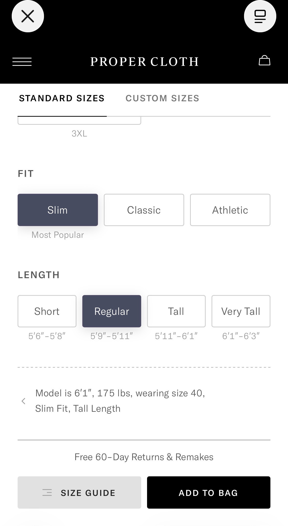
Proper Cloth's sizing screen showing the Slim fit tagged “Most Popular” and a “Free 60-Day Returns & Remakes” guarantee above the Add to Bag button

The sizing screen itself, caught mid-decision: the “Most Popular” tag under Slim fit, and the “Free 60-Day Returns & Remakes” guarantee sitting just above Add to Bag, Social Proof and Loss Aversion doing their work before a customer has committed to anything.

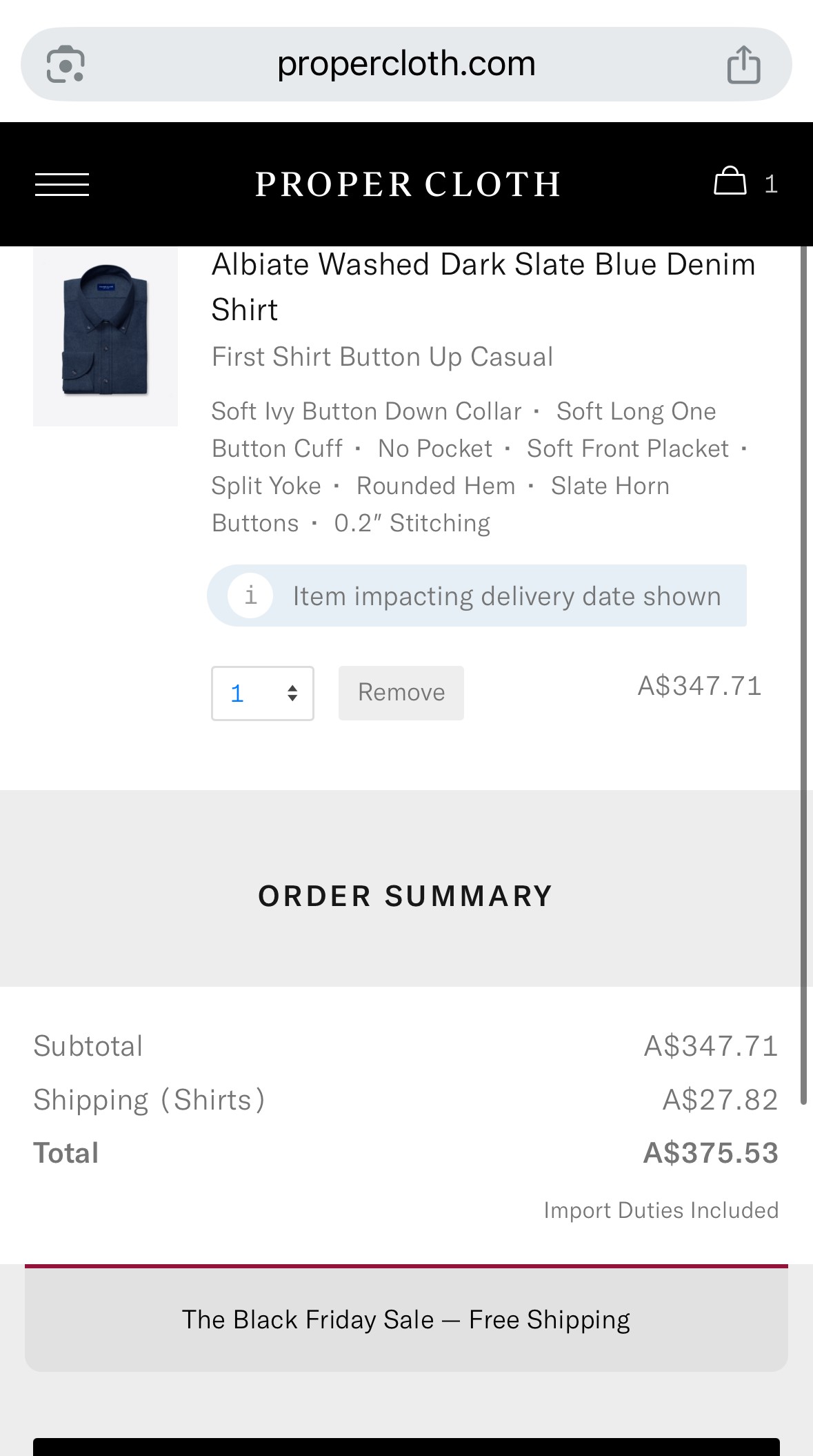
Proper Cloth checkout screen for an Albiate washed dark slate blue denim shirt, total A$375.53

A real order: an Albiate washed dark slate blue denim shirt, built from the Smart Sizes quiz, A$375.53 total with shipping.

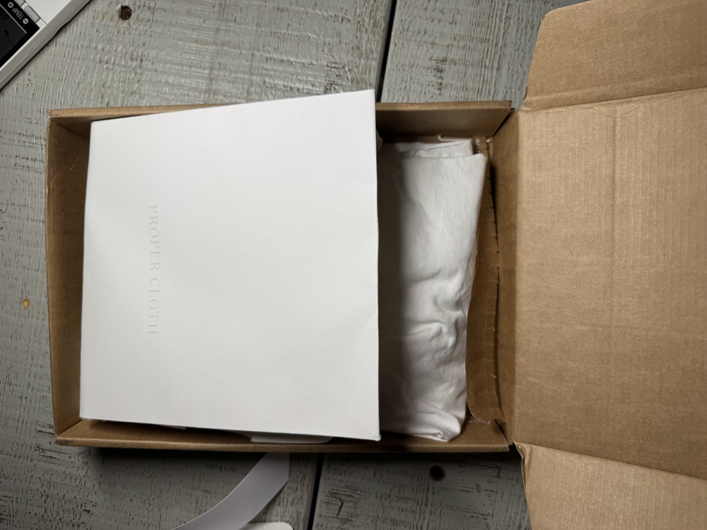
An opened Proper Cloth shipping box with the folded shirt visible inside, in kraft-paper packaging

The shirt on arrival, in Proper Cloth's own recyclable kraft-paper packaging.

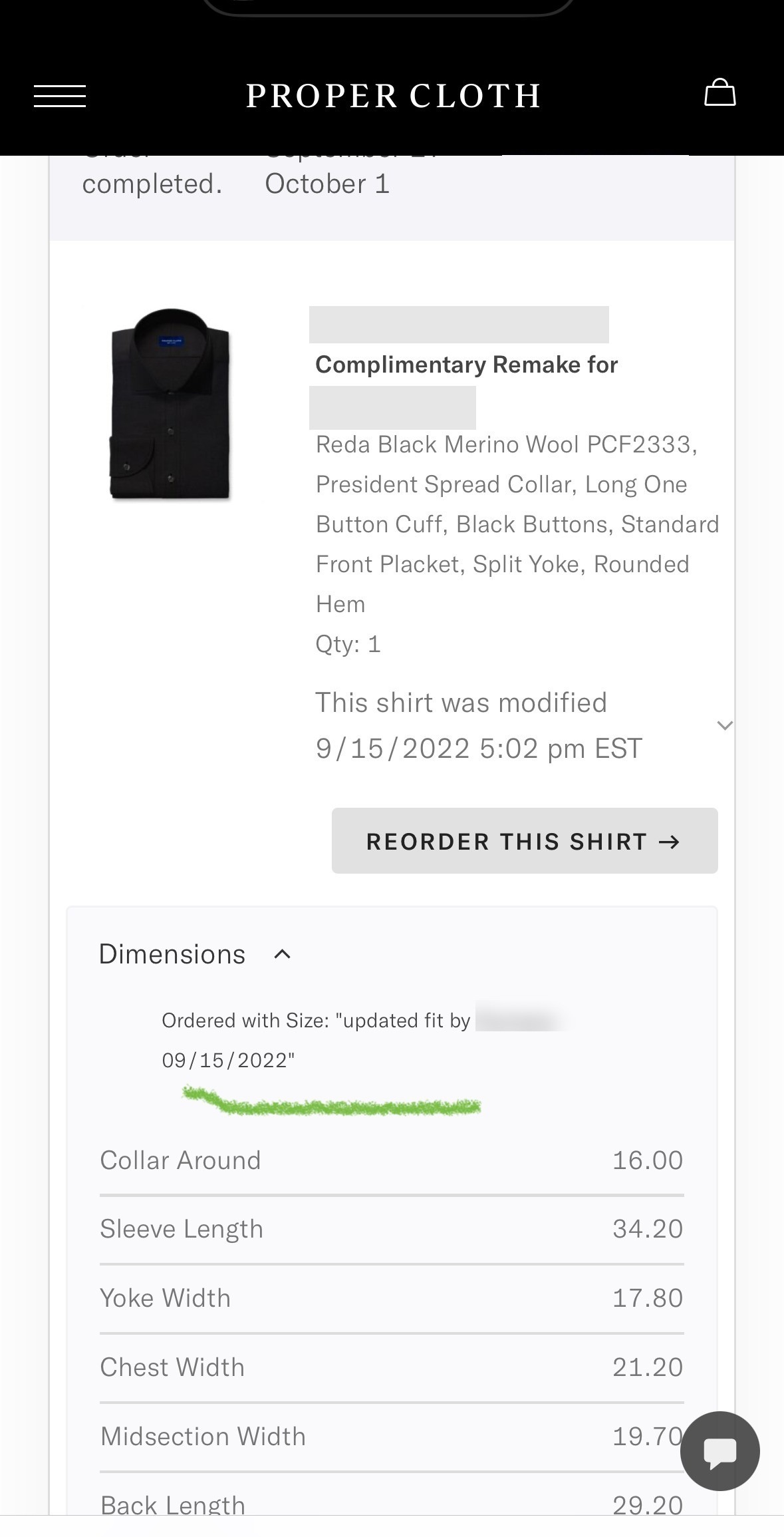
Proper Cloth order history showing a complimentary remake with updated fit dimensions, the staff member's name blurred

The free-remake mechanism decoded above, caught in real use: an order marked “Complimentary Remake,” with the size updated after the first shirt didn't sit right. The Proper Cloth staff member's name is blurred here for their privacy.

Proper Cloth saved shirt size profile showing real collar, sleeve, chest and other dimensions

The same customer's saved Smart Sizes profile, months later: the real collar, sleeve, chest and back-length numbers the algorithm is actually working from.

This is one customer's real order and remake, not proof the algorithm gets every customer's fit right the first time, or that a remake is guaranteed for every order. The “Most Popular” tag is Proper Cloth's own internal claim, not an independently verified figure. Check Proper Cloth's own current policy directly rather than assuming these exact terms still apply.

Real vs. perceived
Genuinely real
  • Both algorithms genuinely predict real fit points, 16 for Proper Cloth, a full generated pattern for Son of a Tailor, from real outcome data on past customers, no tape measure required
  • A Proper Cloth shirt that doesn't fit is genuinely remade in a new size at no extra charge, not simply refunded
  • Each Son of a Tailor garment is genuinely cut from its own individually generated pattern, sewn start to finish by one named person who signs the hangtag, and tracked by account and email updates through production
  • Both design tools genuinely offer real fabric, colour, collar and detail combinations, saved or chosen before the fit questions come up, not a marketing label on a handful of preset bundles
  • Both Trustpilot ratings and review counts are real figures published by an independent third party, not authored or curated by either company
Psychological framing
  • Take-the-Best Heuristic: a handful of quiz answers can feel like your individual body was closely analysed, when the prediction actually draws on patterns across thousands of other people who answered similarly
  • Loss Aversion: Proper Cloth's free remake reads as pure customer-service generosity, when it's also the exact lever that defuses the fear of wasting money on a shirt that can't just go back on a rack
  • Operational Transparency: a signed name on Son of a Tailor's hangtag can feel like proof of extra, personal attention paid specifically to your order, when the same signed attribution is the standard step applied identically to every other customer's garment too
  • IKEA Effect: designing your own shirt or t-shirt can feel like the deciding factor in how good it turns out, when the actual fit and fabric quality come from the algorithm and the mill, not from which collar or colour got picked
  • Social Proof: a high aggregate rating reads as proof the exact mechanism this page decodes works, when it's really an average across shipping speed, customer service and dozens of other things bundled into one number
Sources

Take-the-Best Heuristic, Loss Aversion, Operational Transparency, IKEA Effect and Social Proof are each fully cited, with their real academic study, on their own Principles page entry (linked throughout), including the 2020 study extending IKEA Effect to design-choice customisation specifically. Proper Cloth's own quiz, fit-point count, fabric and collar range, and remake policy are drawn from Proper Cloth's own Smart Sizes page, its design tool, and its published FAQs. Son of a Tailor's own quiz, algorithm claims, design tool, and production process are drawn from its published FAQ and About Us pages; its above-95% accuracy figure is the company's own reported claim, not an independently verified study, and should be read that way. Both Trustpilot ratings and review counts reflect what was published there while researching this page and change continuously; check Trustpilot directly for the current figures rather than this summary. Features and pricing move too; check each company's own site directly for what's current. The “What changes on the second order” section applies the same five cited mechanisms to a repeat purchase; neither company has published data on returning-customer behaviour specifically, so read that section as reasoning from the cited studies, not as its own separately sourced finding.

Real examples
  • Proper Cloth One of the two products decoded above: a 10-question Smart Sizes quiz, 16 fit points, free remake if it's wrong propercloth.com
  • Son of a Tailor The other product decoded above: a five-question Ideal Size algorithm, one named sewer per garment sonofatailor.com
  • Indochino Made-to-measure suits and shirts guided by an online measurement quiz, plus in-person appointments in some cities indochino.com
  • MTailor Skips the questionnaire entirely for a 360-degree phone video; computer vision estimates roughly 60 measurements instead mtailor.com

Real, currently operating providers, shown to illustrate the same mechanism at work elsewhere, not an endorsement of any one of them. Features and pricing move, check each provider's own site for what applies today.

Why does GoalSaver's 4.75% bonus feel like money you'd be losing, not money you haven't earned yet?

CommBank's GoalSaver: a savings account currently paying 5.00% p.a. on balances up to $49,999, made up of a permanent 0.25% base rate plus a 4.75% bonus that only applies in a calendar month with at least one deposit and no withdrawals at all.

Four mechanisms work on that same bonus condition in sequence: how losing it feels, what stops a withdrawal before it happens, why the balance has a name at all, and how close the goal behind it looks.

Money & Banking What Feels Protected
Loss Aversion

GoalSaver's headline number is 5.00% p.a., but that figure is really two rates stitched together: a permanent 0.25% base, plus a 4.75% bonus that only pays out in a calendar month with at least one deposit and zero withdrawals. Frame that plainly and it's a reward for a specific behaviour: deposit, and don't touch it. Frame it the way the account actually presents it, as one combined 5.00% rate, and breaking the no-withdrawal rule stops reading as missing out on a bonus. It reads as losing four fifths of the return already sitting there. That's Loss Aversion, and specifically Clawback: the identical 4.75% weighs more heavily as something to protect than as something still to earn, purely because of which side of the transaction it's described from.

Precommitment Devices

Feeling the bonus as already lost is one thing. The next mechanism stops the withdrawal that would actually cost it. Nobody signs a contract to open a GoalSaver account, but the bonus condition does the same job a formal commitment device would. It attaches a real, felt cost to a future withdrawal, decided in advance, long before the moment of temptation arrives. That's Precommitment Devices at work, minus the paperwork. The account can't stop a withdrawal and doesn't try to; it just makes touching the money cost something concrete the instant it happens, letting a calmer, forward-planning version of a saver constrain a more impulsive one.

Mental Accounting

A locked-in habit still needs a reason to keep going, and that's where naming the balance comes in. CommBank's app pairs GoalSaver with Goal Tracker, which lets a balance be earmarked for a named target, a car deposit, three months of an emergency fund, rather than sitting as an undifferentiated number. Once it carries a label and a purpose, the same dollars stop reading as generic, spendable cash. That's Mental Accounting: money gets filed by purpose, so withdrawing from a labelled “car deposit” account feels like a different, more consequential act than moving money out of a plain, unlabelled savings balance ever would.

Goal Gradient Effect

A name says what the money's for. The last mechanism shows how close it's getting. Goal Tracker doesn't just label the target, it breaks it into weekly instalments and shows how close the current balance sits to the next one. A distant, abstract total gets replaced with a nearby, concrete one. That's the same mechanism Goal Gradient Effect documents in a coffee card: effort and follow-through increase as the visible finish line gets closer, not because the underlying goal changed, but because the felt distance to it did. That's the shape across all four: the same bonus condition, felt as a loss to avoid, backed by a real obstacle, filed under a name worth keeping, and shown getting closer every week.

Real vs. perceived
Genuinely real
  • GoalSaver's condition is a genuine binary: any withdrawal at all in the calendar month drops the whole balance to the 0.25% base rate for that month, not a partial reduction
  • Westpac Life and ING Savings Maximiser use a different, looser condition, a net-growing balance by month-end, so a withdrawal that's replaced before the month closes doesn't cost the bonus the way it does on GoalSaver
  • The bonus component is capped by balance (GoalSaver: up to $49,999; ING Savings Maximiser: up to $100,000), a real structural limit disclosed in each bank's own terms
Psychological framing
  • Loss Aversion: one combined 5.00% rate makes breaking the condition feel like losing money already earned, not skipping money not yet earned
  • Precommitment Devices: a real, felt cost attached in advance to a future withdrawal, with no formal contract behind it
  • Mental Accounting: a named, goal-labelled balance reads as already spoken for, not as generic, spendable cash
  • Goal Gradient Effect: weekly milestones make a distant savings target feel close enough to keep pushing towards
Sources

Each mechanism above is fully cited, with its real academic study, on its own Principles page entry (linked throughout): Loss Aversion (Tversky & Kahneman, 1991), Precommitment Devices (Ariely & Wertenbroch, 2002), Mental Accounting, and Goal Gradient Effect. GoalSaver's own rate, condition, and balance cap are drawn from CommBank's GoalSaver page and CommBank's own guidance on earning the bonus; Goal Tracker's milestone feature is drawn from CommBank's Goal Tracker page. A bank's rates and conditions move, check CommBank's own site directly rather than assuming this summary still holds.

Real examples
  • CommBank GoalSaver The product decoded above: 5.00% p.a. up to $49,999, zero withdrawals required each month commbank.com.au
  • Westpac Life A looser condition: grow your balance by month-end, withdrawals are fine as long as you replace them westpac.com.au
  • ING Savings Maximiser Also a net-growth condition, plus a linked transaction account deposit and card-use requirement ing.com.au

Real, currently operating providers, shown to illustrate the same mechanism at work elsewhere, not an endorsement of any one of them. Rates and conditions move, check each provider's own site for what applies today.

How does Up Bank's behavioural design pay off for both the bank and its customers?

Up is an Australian neobank: no branches, no over-the-counter service, everything happens inside the app. That's a genuinely different starting point from a bank like CommBank, which still has both a branch network and an app to design around. The same design instinct shows up at every stage of Up's app, in the order these features actually appear. It starts with a small saving habit and builds all the way up to the single biggest ask in the app, a home loan. Then it runs back down to the smallest, a $5 coffee refunded on a live page where a reward pool ticks toward zero and a win ticker updates minutes after it happens. One more stop joined that list on 1 September 2026, and it plays by a different rule than the seven before it. It protects money the customer never got to choose to set aside at all: the recurring bills sitting underneath everything else.

At each of the eight stops below, Up picked the version of the mechanism that pays the bank back in kept deposits and everyday engagement without costing the customer the benefit the mechanism is built on.

Money & Banking What Feels Effortless
Loss Aversion
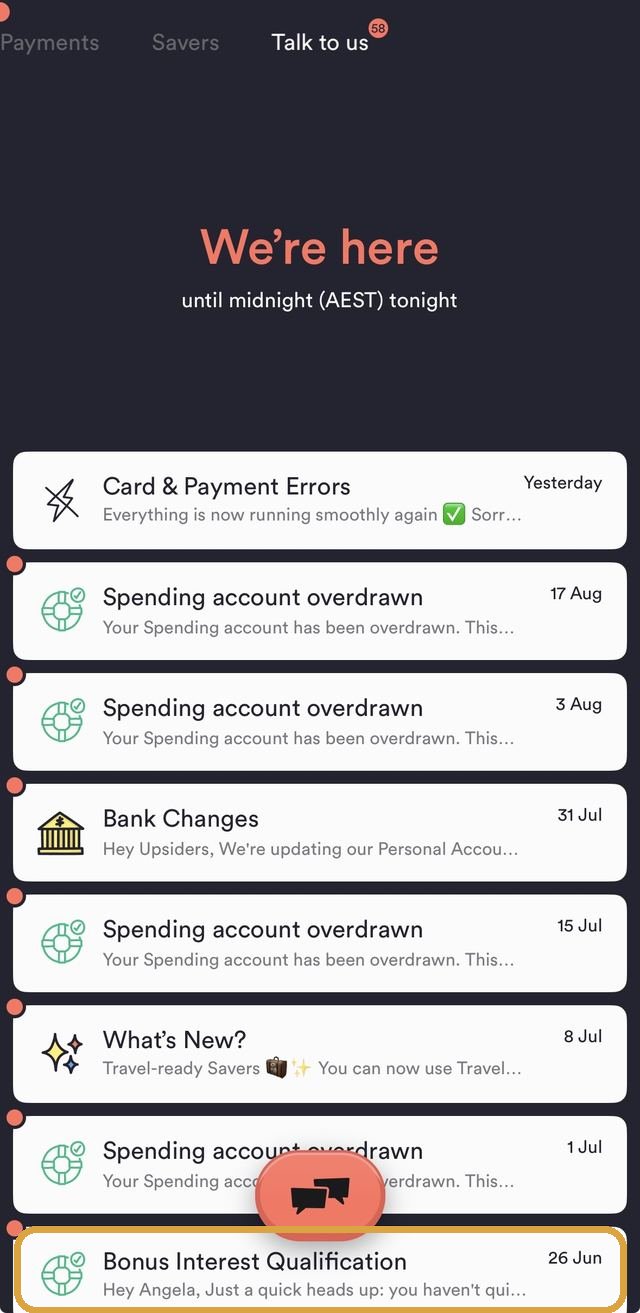
Up's 'Talk to us' inbox, the 'Bonus Interest Qualification' row boxed, warning a customer they haven't yet qualifiedBoxed: the proactive nudge, sent before the bonus lapses

Start with the simplest moment in that journey: a bonus a customer has already half-earned, about to quietly lapse. Up's own Savers carry a bonus-rate condition of the same shape GoalSaver uses, tied to real activity in the calendar month. Its “Talk to us” inbox sends a proactive “Bonus Interest Qualification” message partway through the month, warning a customer who hasn't yet met it. It's a textbook honest use of Loss Aversion and its sharper cousin Clawback. The bank could just let the bonus quietly lapse and keep the difference, the way the mechanism alone would predict. Instead it spends a notification telling the customer exactly how to avoid the loss it's already framed as theirs.

Precommitment Devices

Protecting a bonus after the fact only goes so far. The next feature builds in Precommitment Devices permanently, minus the paperwork, before temptation ever arrives. Locked Savers let a customer lock a Saver behind a real, if modest, obstacle: a 3-hour delay before the money becomes accessible again, with an option to nominate a mate on Up who can unlock it early if asked. It's a real, felt friction attached in advance to a future withdrawal, decided by a calmer version of the customer before the moment of temptation exists. The mate-key option adds a second, social layer on top. Asking someone else to break the lock costs more than tapping a button ever would.

Mental Accounting
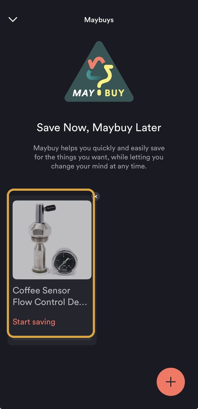
Up's Maybuys feature, the product card boxed: 'Save Now, Maybuy Later', saving towards a real photo of a specific coffee machine partBoxed: a photo of the actual thing, not a number

A locked Saver still needs a reason strong enough to leave alone, and Up's next feature gives it one, a sharper version of Mental Accounting than a name alone provides. Up's Savers can be named and given an emoji, up to 50 of them, so a balance reads as “Home Deposit” or “Holiday” rather than an undifferentiated number. Maybuys takes this further: instead of a named account, it saves towards a photo of the actual product a customer wants, imported straight from a listing, “while letting you change your mind at any time.” Money filed against a real, pictured thing is harder to casually spend than money sitting in a plain, unlabelled balance.

Goal Gradient Effect
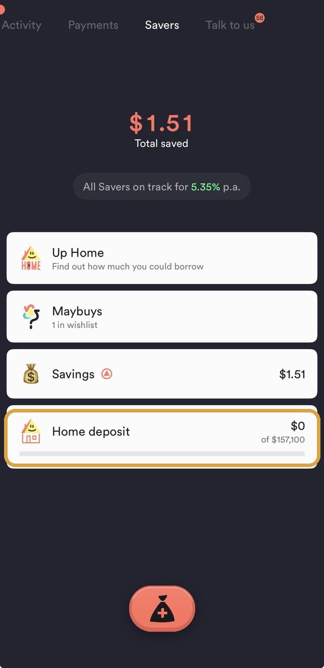
Up's Savers list, the Home deposit row boxed: its own progress bar against a real target, at $0 of $157,100Boxed: the one Saver still at $0 of its target

Naming a Saver says what the money's for. It doesn't say how close it is, which is where Goal Gradient Effect picks up. Every Saver on Up renders its own progress bar against its real target, right there in the account list, not buried a tap away. It's the same mechanism a coffee card documents: effort and follow-through increase as the visible distance to the finish line shrinks, not because the goal itself changed but because how close it looks did. A $0-of-$157,100 bar describes the identical remaining task very differently to a $140,000-of-$157,100 one.

Chunking
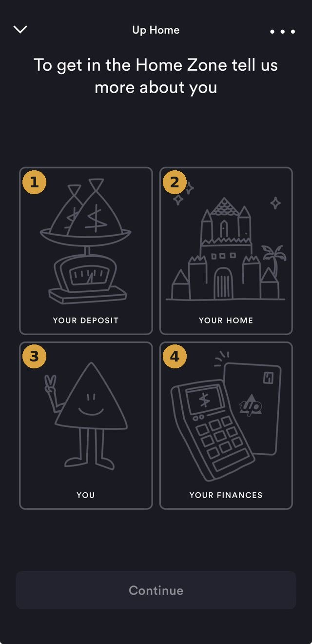
Up Home's borrowing-power intake, numbered 1 to 4: Your Deposit, Your Home, You, Your FinancesNumbered: one long form, split into four labelled steps

Every mechanism so far has worked on everyday saving habits. Up applies the identical instinct, Chunking, to the single biggest ask in the app, a home loan. Up Home's borrowing-power tool, The Home Zone, never presents itself as one long financial-disclosure form: it's split into four labelled categories (Your Deposit, Your Home, You, Your Finances). The deposit goal gets the same treatment, turning a $157,100 target into “$2,618.34 every fortnight,” with a specific projected date attached, the identical mechanism applied twice in one flow, once to the intake task and once to the number itself. A large ask broken into several smaller ones clears a mental bar the whole amount, presented at once, wouldn't.

Scarcity
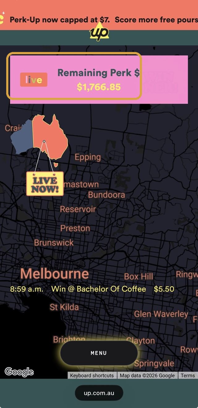
Up's Perk-Up live web page, the 'Remaining Perk $1,766.85' pool boxed, above a real-time map of where wins are happeningBoxed: the pool, ticking down in real time

From the biggest financial commitment in the app to its smallest, the same design logic shows up again, aimed at a $5 coffee instead of a six-figure deposit. This time it's Scarcity made literal instead of implied. Perk-Up refunds one small coffee purchase (up to $5) per person, per eligible weekday morning, on a promotional pool with a real, published cap. Up's live tracking page shows that pool as a single number counting down in real time, “Remaining Perk $1,766.85,” ticking lower as more people win. The reward isn't just occasionally available, it's visibly, numerically running out, a different and stronger cue than a flat “while supplies last.”

Social Proof
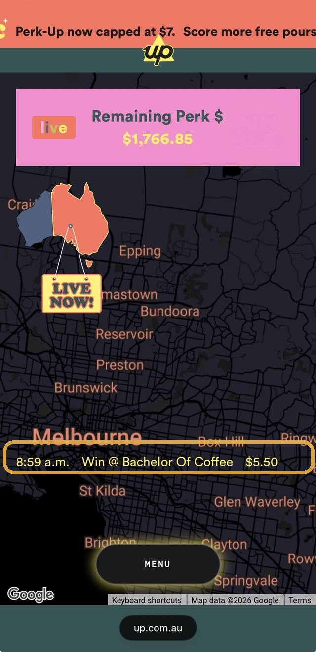
The same Perk-Up live page, the real-time win ticker boxed: '8:59 a.m., Win at Bachelor Of Coffee, $5.50'Boxed: a real win, timestamped, minutes ago

Scarcity alone would already pull people in. Up pairs it with Social Proof, a second, social cue running alongside it. The same live page shows that draining pool next to a real-time win ticker, “8:59am, Win @ Bachelor Of Coffee, $5.50,” refreshing as it happens and plotted on a map. Seeing that real people, nearby, are winning right now makes trying feel more worthwhile than a static promotional banner claiming the same odds ever could.

Pain of Paying
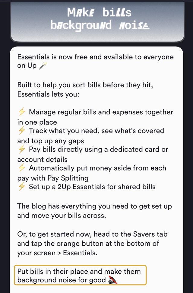
Up's in-app 'What's New' announcement for Essentials, the closing line boxed: 'Put bills in their place and make them background noise for good'Boxed: Up's own name for the mechanism

Every stop so far has protected money the customer actively chose to set aside, a Saver, a home deposit, a coffee perk. Essentials, launched on 1 September 2026, protects money the customer never got to choose: the bills that arrive whether anyone's ready or not. It pulls recurring bills and subscriptions into their own account. Essentials works out how much each pay needs to cover them, moves that amount automatically through Pay Splitting, then pays the bill straight from a dedicated card once it lands. The bill itself never has to be felt as a decision, because the decision already happened on payday. Pain of Paying works in reverse here: a prepaid coffee subscription tastes better than paying cup by cup because it decouples when the money leaves your account from when you'd otherwise notice it. The same decoupling now runs on electricity bills and streaming subscriptions instead of coffee. Up's own name for the result is the most literal version of the mechanism on this whole page: “make bills background noise.”

That's the pattern across all eight stops: a real mechanism, aimed at a real behaviour. Up's own upside only shows up once the customer actually gets the thing the mechanism promised, a bonus rate kept, a habit followed through, a home loan actually funded, a coffee actually saved on, and now a bill that never gets to feel like a surprise.

Real vs. perceived
Genuinely real
  • The Home Zone's borrowing estimate and deposit-goal maths use real inputs (property price, income, existing savings), not a fixed marketing number
  • Locked Savers' delay is a genuine 3 hours, disclosed on Up's own blog, not an indefinite or hidden lock
  • Perk-Up's remaining pool and per-person daily cap are both real, published limits under the promotion's actual terms and conditions
  • Up Home's advertised rate (5.95% p.a. comparison rate at time of writing) is a single published number, not a teaser rate that resets after an introductory period
  • Essentials carries its own real BSB and account number and a dedicated digital debit card, a genuinely separate account rather than a labelled bucket inside the existing Spending account
Psychological framing
  • Loss Aversion: a proactive warning frames the bonus as already the customer's to lose, not a reward still to be earned
  • Precommitment Devices: a real but modest 3-hour obstacle, plus an optional social cost, stands in for actual self-control
  • Mental Accounting: a named Saver, or a photo of the actual item, makes identical dollars feel less spendable than an unlabelled balance
  • Goal Gradient Effect: a visible progress bar changes how close a goal feels without changing the goal itself
  • Chunking: the same $157,100 clears a different mental bar as four labelled steps and a fortnightly figure than as one lump sum
  • Scarcity and Social Proof: a counting-down pool and a live win ticker make a fixed-odds promotion feel more urgent and more winnable than the same odds stated plainly would
  • Pain of Paying: funding bills automatically ahead of time doesn't change what they cost, it changes whether paying them ever gets felt as a decision
Where it could go further
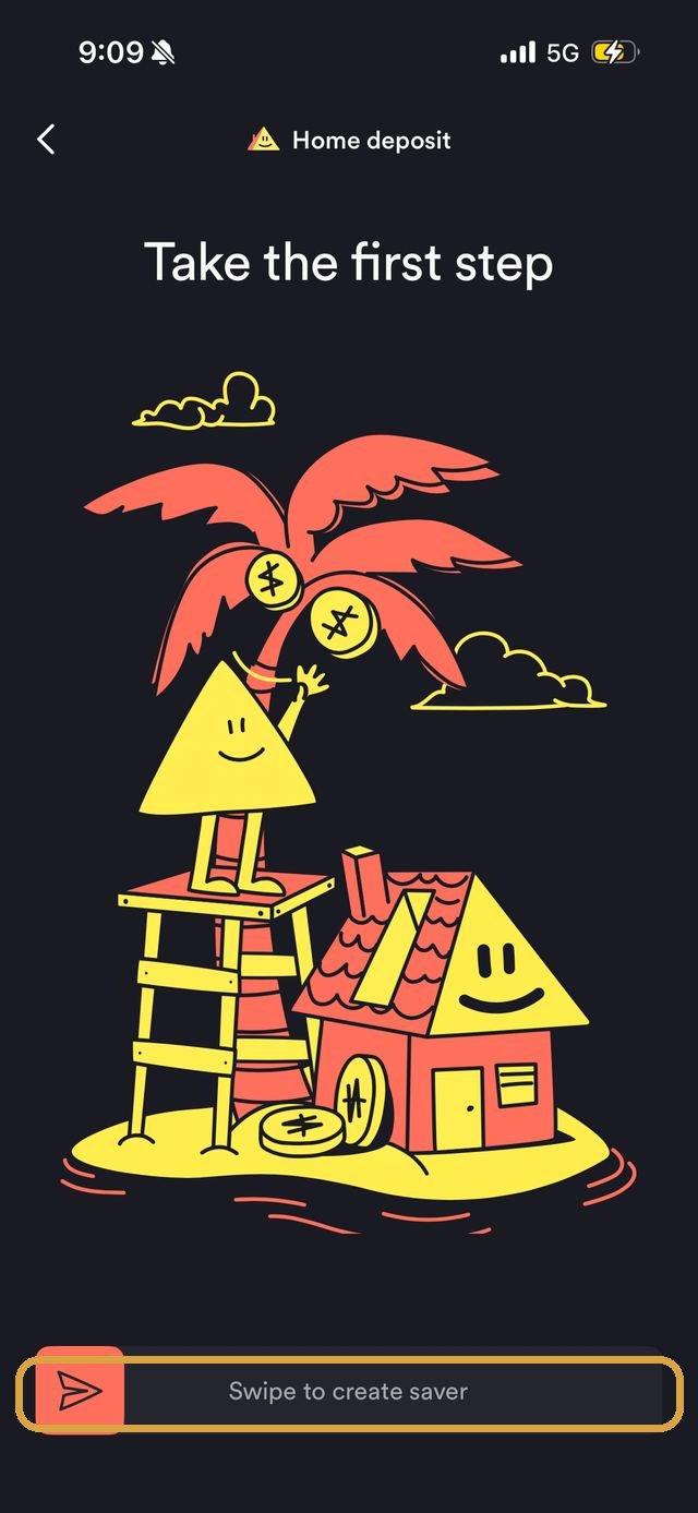
Up Home's final confirmation screen for a deposit Saver, the 'Swipe to create saver' gesture boxedBoxed: the one moment Up adds friction on purpose

The same “Talk to us” inbox that proactively warns a customer before they lose bonus interest still handles overdrafts reactively. Several separate “Spending account overdrawn” alerts land on the same account over several months, each one sent after the overdraft already happened. Up has already proven, with the bonus-interest nudge, that it can warn a customer before a real cost lands. Applying that identical pattern to a low-balance warning before an overdraft, not just a notice after, would extend a mechanism Up has already validated rather than inventing a new one. Essentials, launched the same day as this write-up, targets this exact gap for bills specifically, setting money aside before a bill lands rather than warning after the account's already overdrawn. Whether it actually reduces these particular overdraft alerts in practice isn't something this piece can confirm yet, that needs real usage data Up hasn't published.

Locked Savers uses one fixed 3-hour delay for every Saver, regardless of size or purpose. That's not a flaw to simply loosen: this site's own citation for Precommitment Devices (Ariely & Wertenbroch, 2002) found that externally-set constraints reliably outperform ones people set for themselves. Making the delay user-adjustable would risk undermining the exact mechanism it relies on. A more consistent extension would keep the delay externally set but tier it by stake: the existing 3 hours for everyday Savers, a longer bank-set default (a day, say) for a large, slow goal like a Home Deposit Saver. A coffee-purchase-sized obstacle is a much smaller relative barrier there than it is on a smaller balance.

Sources

Each mechanism above is fully cited, with its real academic study, on its own Principles page entry (linked throughout): Loss Aversion (Tversky & Kahneman, 1991), Precommitment Devices (Ariely & Wertenbroch, 2002), Mental Accounting, Goal Gradient Effect, Chunking, Scarcity, Social Proof, and Pain of Paying. Up's own features are drawn from Up's Savers page, Up's Locked Savers blog post, Up's Hi-Fi page, Up's Perk-Up page and its published terms, Up's Essentials blog post, and The Tree of Up, Up's own public product roadmap. Up's rates, conditions, and screens move; check Up's own site and app directly rather than assuming this summary still holds.

Real examples
  • Monzo, Pots & Roundups UK neobank, named savings pots plus automatic spare-change roundups into them monzo.com
  • Revolut, Vaults UK/EU neobank, similarly named goal-based savings vaults with automatic roundups revolut.com

Real, currently operating providers, shown to illustrate the same category of feature at work elsewhere, not an endorsement of any one of them. Features and terms move, check each provider's own site for what applies today.

Why does a $2.50 fries deal come with a chance to win free food for life?

McDonald's Australia app, spotted 2026: a $2.50 large fries deal, pickup only, tagged “Today's Golden Deal” and expiring at midnight. Sitting right under the price is the line doing the real work here: “Plus, a chance to WIN!”, promising entry into a draw for free McDonald's food for life. The deal's real odds never appear on this screen, only a separate “View terms of this offer” link a customer would have to leave the deal to go read.

Food & Drink What Feels Lucky
Probability Weighting

On its own, $2.50 for a large fries is a plain, everyday discount, easy to compare against yesterday's price and forget within the hour. The prize draw changes what kind of moment this is. Once a purchase carries “a chance to win” something as vivid as free food for life, the mind stops weighing the real, probably tiny odds correctly and treats almost any small chance as similarly worth chasing, the same distortion that makes a lottery ticket feel like a reasonable thing to buy. The golden coin badge and “Today's Golden Deal” banner do the job of making the moment feel charged, while the actual likelihood of winning sits one tap away, in the terms, where most people buying $2.50 fries will never go looking for it.

That distortion carries real emotional weight. A 2020 field experiment found that simply holding a lottery-style ticket measurably lifts a person's happiness in the hours before the draw, whether or not it wins anything, and a separate study found people overweight a small chance of something emotionally vivid even more than an equally small chance of plain cash. Buying the fries buys a few minutes of a genuinely felt hope, a small emotional high that has nothing to do with the real odds of ever collecting on it. That's Probability Weighting: the felt size of a tiny chance, and the real excitement it produces, comes from how it's framed, not from the number itself.

Real vs. perceived
Genuinely real
  • A $2.50 large fries deal, valid the one day it's shown, redeemable either through an in-app pickup order or a MyMacca's Rewards code at drive-thru, kiosk, or counter
  • The prize draw's actual odds, entry mechanics, and eligibility sit behind a separate “View terms of this offer” link, not on the deal screen itself
  • The $2.50 fries purchase is what enters a customer into the draw; nothing about the fries themselves changes
Psychological framing
  • Probability Weighting: a routine, near-certain $2.50 purchase reads as newly exciting once a prize draw is attached to it
  • Probability Weighting: leaving the real odds unstated doesn't undersell the offer, almost any small number feels similarly worth chasing once it's framed as a chance to win
  • Probability Weighting: the whole deal feels worth more than a plain $2.50 fries discount ever would on its own
  • Probability Weighting: the hope felt while deciding to buy is a genuine, measured emotional lift, real regardless of whether the draw is ever won
Sources

Probability Weighting is fully cited, with its real academic study, on its own Principles page entry (Kahneman & Tversky, 1979), along with the two studies behind the emotional dimension above: Rottenstreich & Hsee (2001) on affect-rich probability weighting, and Burger, Hendriks, Pleeging & van Ours (2020) on the real, measured happiness lift from simply holding a ticket. The deal's own price, terms structure, and redemption options are drawn directly from the McDonald's Australia app screen itself, captured 2026; a live promotion like this rotates daily, so check the app directly for whatever deal is actually running today.

Real examples
  • McDonald's Monopoly McDonald's own long-running annual promotion, distributing instant-win and collect-to-win game pieces to purchases made through the MyMacca's App mcdonalds.com
  • Hungry Jack's Sip & Score A 1-in-3 chance to win instant prizes with any coffee or iced drink bought through the Hungry Jack's App or loyalty card frugalfeeds.com.au
  • Bankwest Easy Saver A chance for 50 monthly winners to get an 11.50% p.a. “Interesting Rate” for opening a savings account with a code, versus a guaranteed 5.75% p.a. intro rate for everyone else, framed as: “Not a winner? You'll still feel like one” bankwest.com.au

Real, currently operating promotions, shown to illustrate the same mechanism at work elsewhere, not an endorsement of any one of them. Terms and odds move, check each brand's own site for what applies today.

Why do you have to be “into double denim” to win a better savings rate?

Bankwest's 2026 “Interesting Rates” campaign: open an Easy Saver with a promo code and you're entered to win an “Interesting Rate” of 11.50% p.a. fixed for four months, stacked on top of a savings account you'd have opened anyway. The first monthly round's code was literally DENIM, tied to being “into double denim,” with two more oddly specific, equally playful rounds following in the months after. Fifty winners a month get the headline rate. Everyone else still gets a real, if smaller, prize.

Follow the promotion in the order a real applicant actually meets it, and three different mechanisms are doing three different jobs. The 11.50% headline is what makes opening the account worth a second look. The rate everyone else gets is relabelled so losing the actual draw doesn't feel like losing anything. And the one extra step required to enter, downloading an app, is framed as something you stand to lose by skipping, not just a mild inconvenience.

Money & Banking What Feels Lucky
Probability Weighting

An Easy Saver's real, everyday rate is a competitive but ordinary 5.75% p.a. introductory rate, later dropping to a 5.00% p.a. ongoing rate, both capped at balances up to $250,000.99. On its own, that's just one more savings account to compare against ING or Westpac. Bundling it with a monthly draw for something bigger changes what kind of decision this is: the real odds of being one of 50 winners a month are never stated anywhere in the promotion, and neither is how many people actually open an account with a code that month. That's Probability Weighting: the 11.50% figure gets weighted as though it's a live, reachable outcome, not a number attached to odds nobody, including the applicant, can actually calculate.

Framing Effect

A prize this specific needs a soft landing for everyone who doesn't win it, and Bankwest built one directly into the screen. The account's ordinary introductory rate, 5.75% p.a., the exact rate every non-winner already gets regardless, sits under its own black “Still a ‘winner’” badge, and the confirmation copy reads: “Not a winner? You'll still feel like one with a 5.75% p.a. variable intro rate.” Nothing about the rate changed. What changed is the label sitting on top of it. That's Framing Effect: the same base rate, worded as a consolation, reads as coming second; worded as a win, it reads as one.

Loss Aversion

Relabelling the fallback rate handles the disappointment of losing the draw. The next screen handles a completely different kind of resistance: the friction of installing an app just to open a savings account. Try to continue in a browser and Bankwest doesn't just make the app optional, it puts a cost on skipping it: “Skip the app? You'll miss your chance to enter,” sitting directly above the button that lets you continue online anyway.

Downloading an app is ordinarily a neutral extra step, easy to defer. Framed this way, it isn't a step at all, it's the one thing standing between the applicant and a prize they already want. That's Loss Aversion: the same optional download reads completely differently once skipping it is described as something you'd be giving up.

Real vs. perceived
Genuinely real
  • Published rates: 11.50% p.a. fixed for 4 months (50 monthly winners only), 5.75% p.a. variable intro rate (everyone else, first 4 months), 5.00% p.a. ongoing standard variable rate, all up to $250,000.99
  • The competition runs across three monthly rounds with their own entry codes, open to WA, NSW, VIC and QLD residents 18+, maximum one entry and one prize per person
  • The Bankwest app can genuinely be skipped; a working “Continue online” option sits on the same screen as the warning against it
Psychological framing
  • Probability Weighting: the 11.50% figure gets weighted as a reachable outcome despite real odds that are never stated or calculable
  • Framing Effect: the same 5.75% every non-winner already gets is relabelled a “win” instead of a consolation
  • Loss Aversion: skipping the app reads as forfeiting something already yours, not as declining an optional convenience
Sources

Probability Weighting, Framing Effect, and Loss Aversion are each fully cited, with their real academic studies, on their own Principles page entries (linked throughout): Kahneman & Tversky (1979), Levin & Gaeth (1988), and Tversky & Kahneman (1991) respectively. The campaign's own rates, codes, and screen copy are drawn directly from Bankwest's “Interesting Rates” promotion and its published competition terms, captured 2026; a live promotion like this changes rounds and rates over time, so check Bankwest's own site and terms directly rather than assuming this summary still holds.

Real examples
  • Bankwest Interesting Rates The promotion decoded above: 11.50% p.a. fixed for 4 months for 50 monthly winners, everyone else gets 5.75% p.a. bankwest.com.au
  • McDonald's Australia app The same overweighted-chance mechanism decoded on a $2.50 fries deal with a draw for free food for life Decoded above

Real, currently operating promotions, shown to illustrate the same mechanisms at work elsewhere, not an endorsement of any one of them. Rates, codes, and terms move, check each provider's own site for what applies today.